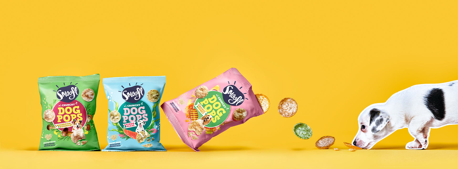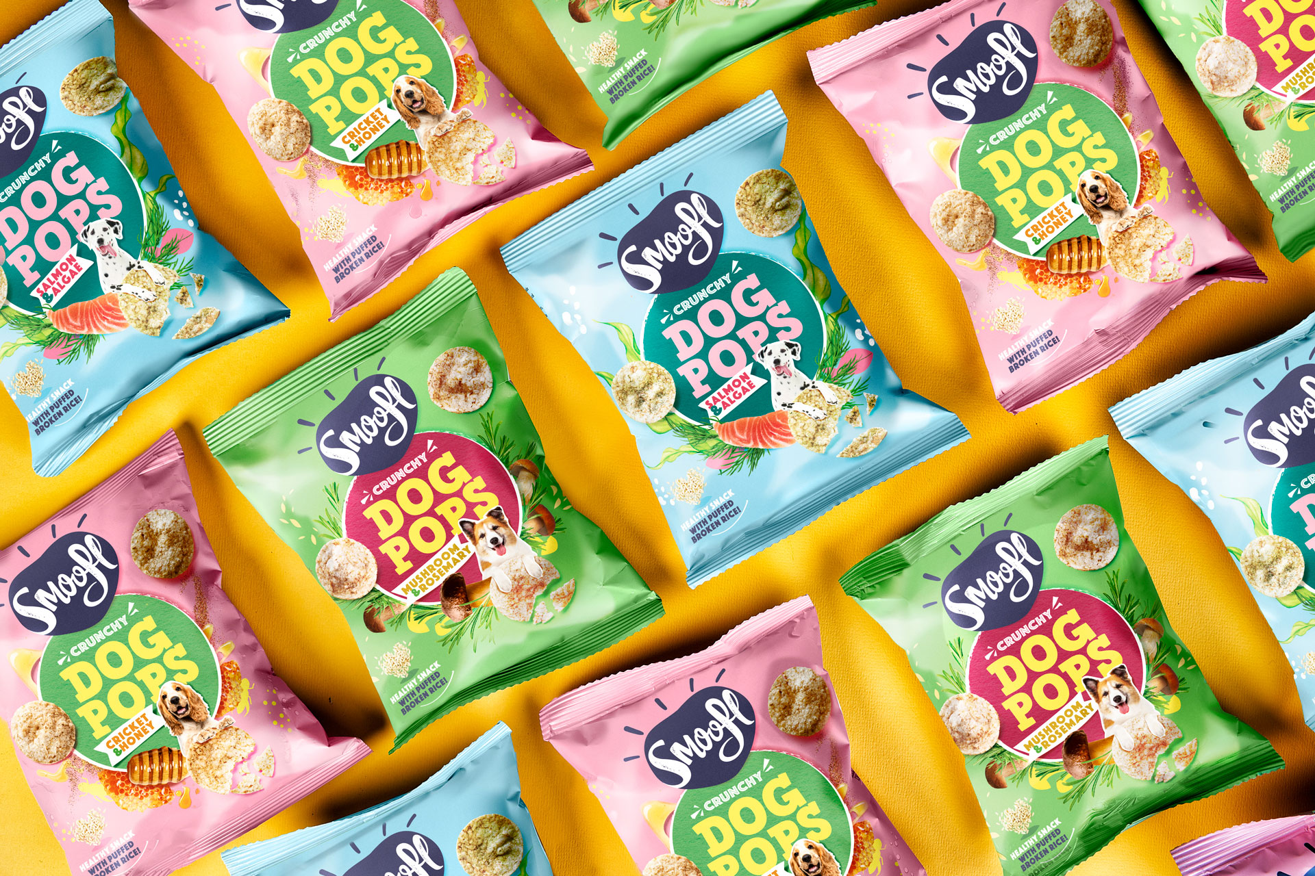


Smoofl was on a mission to broaden its horizon, aiming to introduce various product ranges, starting with the Dog Pops, a healthy snack made with puffed broken rice. Developing a fixed brand architecture became crucial. We had to devise a design that was not only consistent and easily recognizable but also adaptable enough to highlight the unique features of each product, while ensuring flavor differentiation within each range. We came up with a central packaging device that could be personalized based on the distinct personality of each product, adding a touch of character to the line-up.


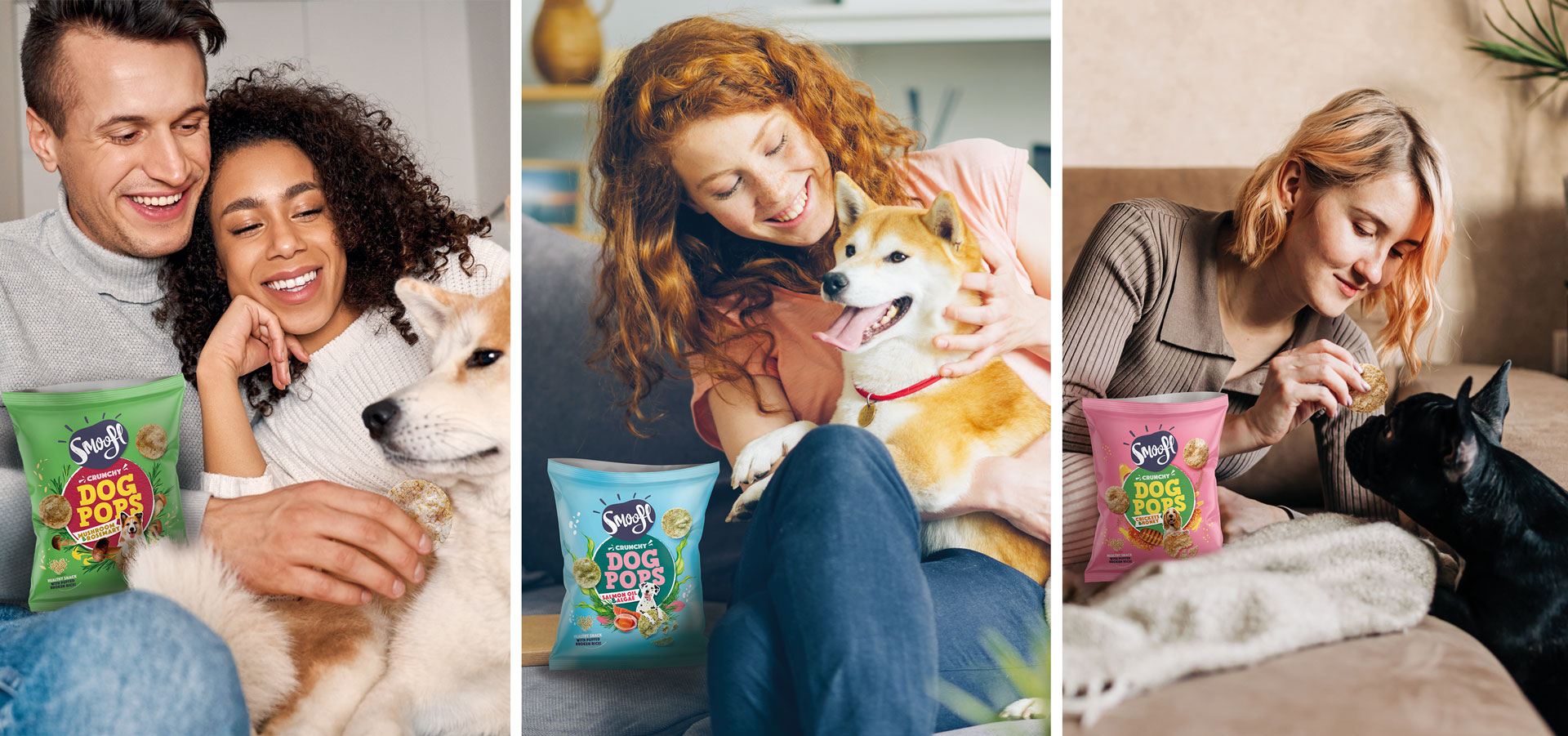
Embracing Smoofl’s vision of treating every dog like a cherished member of the family, our goal was to design a packaging that met human-grade snack expectations. The result? An inclusive design that bursts with vibrancy, where the dog pops float around and ingredients pop out from behind the central device, unleashing the expressive personality of the snack world. Next came colour. Each pack needed to celebrate the pure joy of indulging in these dog pop snacks, making them stand out in the shelves. Tying it all together in a crystal-clear central message, sealed with the ultimate confirmation of a delighted dog, joyfully looking up while embracing his crunchy pop.

Smoofl would not be Smoofl if they were not already one paw ahead. Fresh off the launch of these mouthwatering dog pops, they are cooking up some exciting new products to expand their product portfolio. So, stay tuned for more tail-wagging goodness!
