<div class="content-width"</div>
STRATEGY
Stepping into the world of retail and foodservice was new territory for Jasper. So, in close collab with Kate, we guided him through every stage. From defining what makes a brand stand out in a crowded, competitive category to building a story that jumps off the pack.
We challenged Jasper to think bigger: to create a brand bold enough to go head-to-head with established names, yet authentic enough to win hearts. A brand that didn’t end up as just another ‘light’ product. Bit by bit, we mapped out the strategy, the vision, and five core values that would shape his brand. Meanwhile, Jasper kept perfecting his sauces, ensuring that the taste and its health benefits matched the ambition.
PACKAGING DESIGN
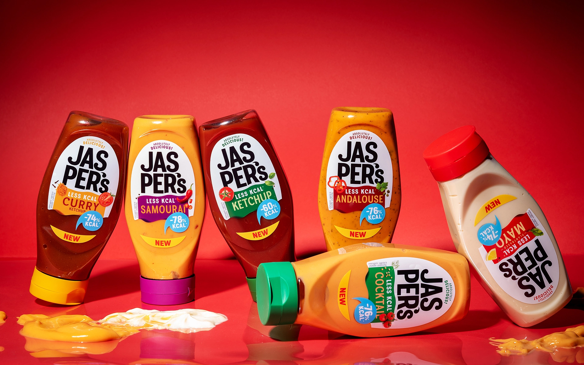
Fueled by Jasper’s enthusiasm, we set out to design a packaging that really could stand out in the shelves. A design that makes a statement and aims to become the new standard in its category.
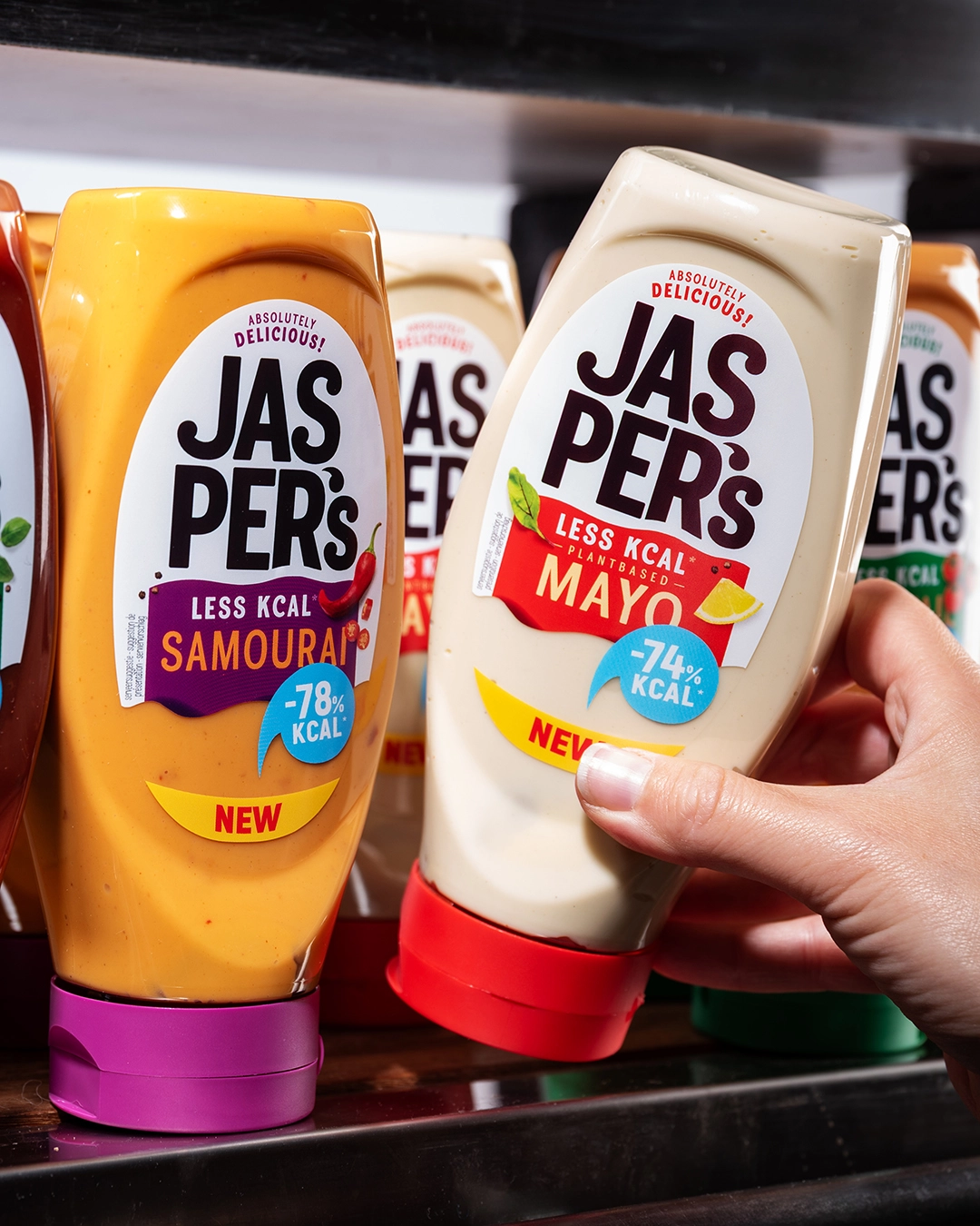
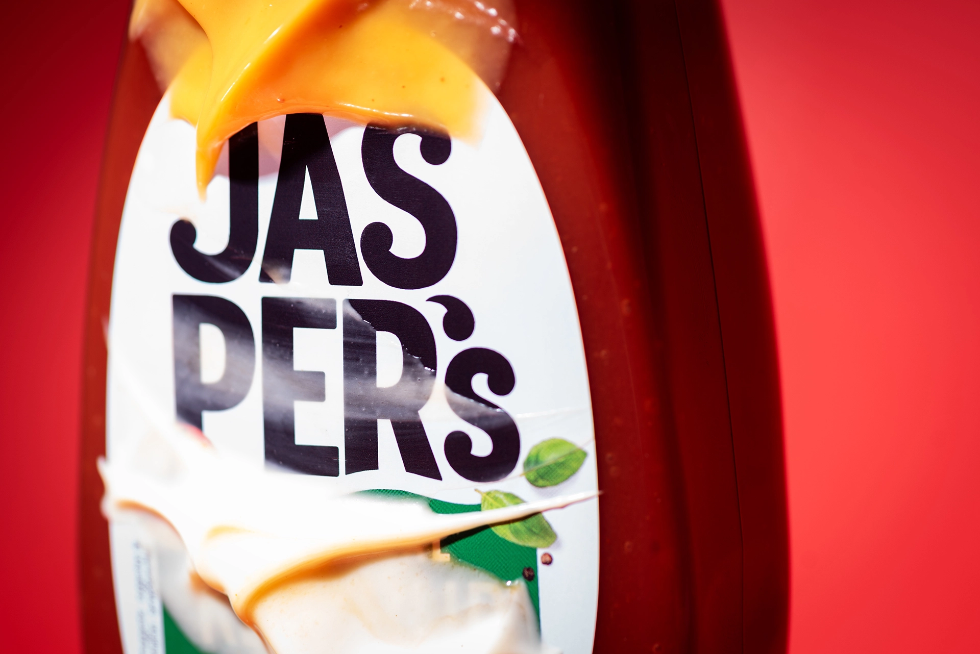
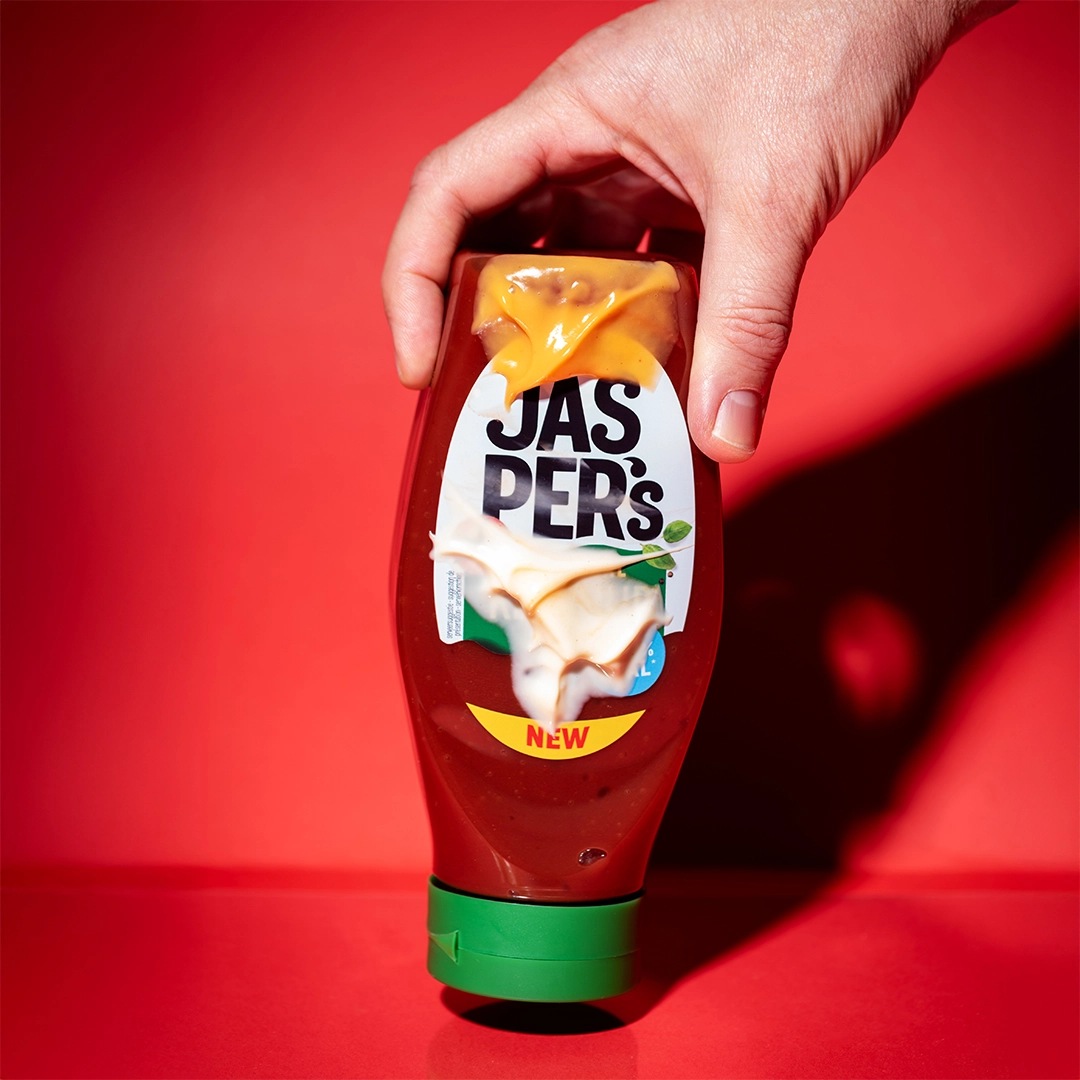
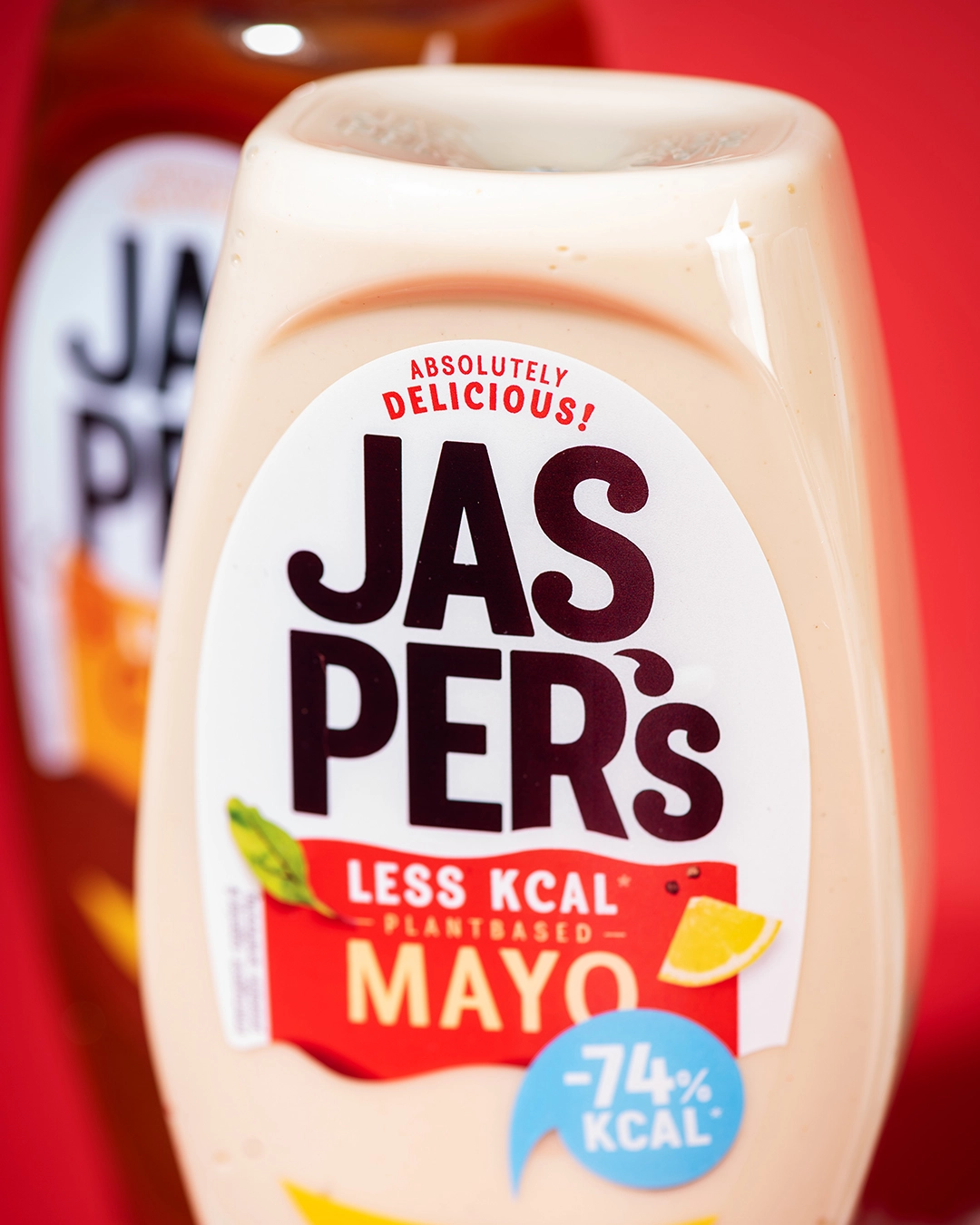
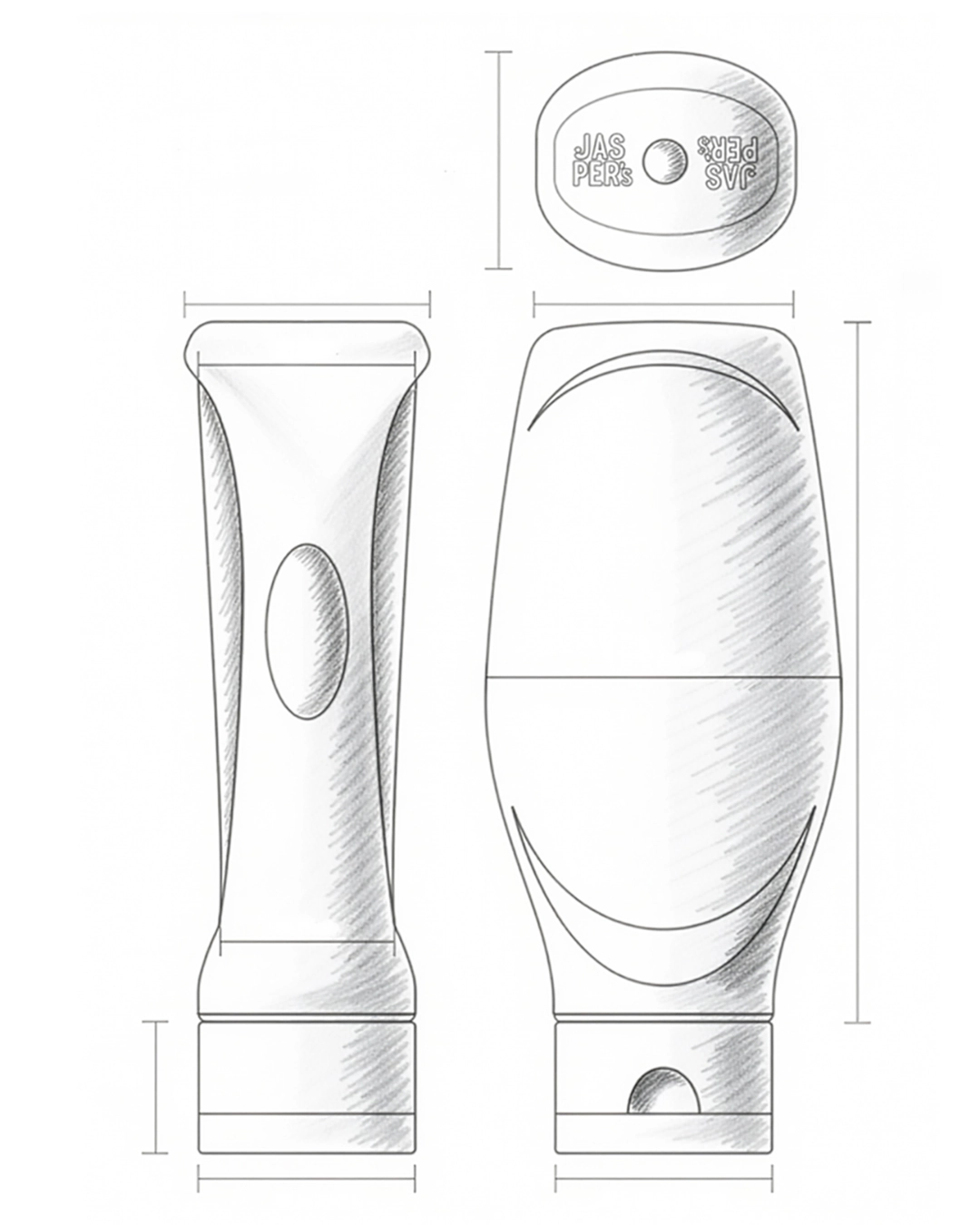
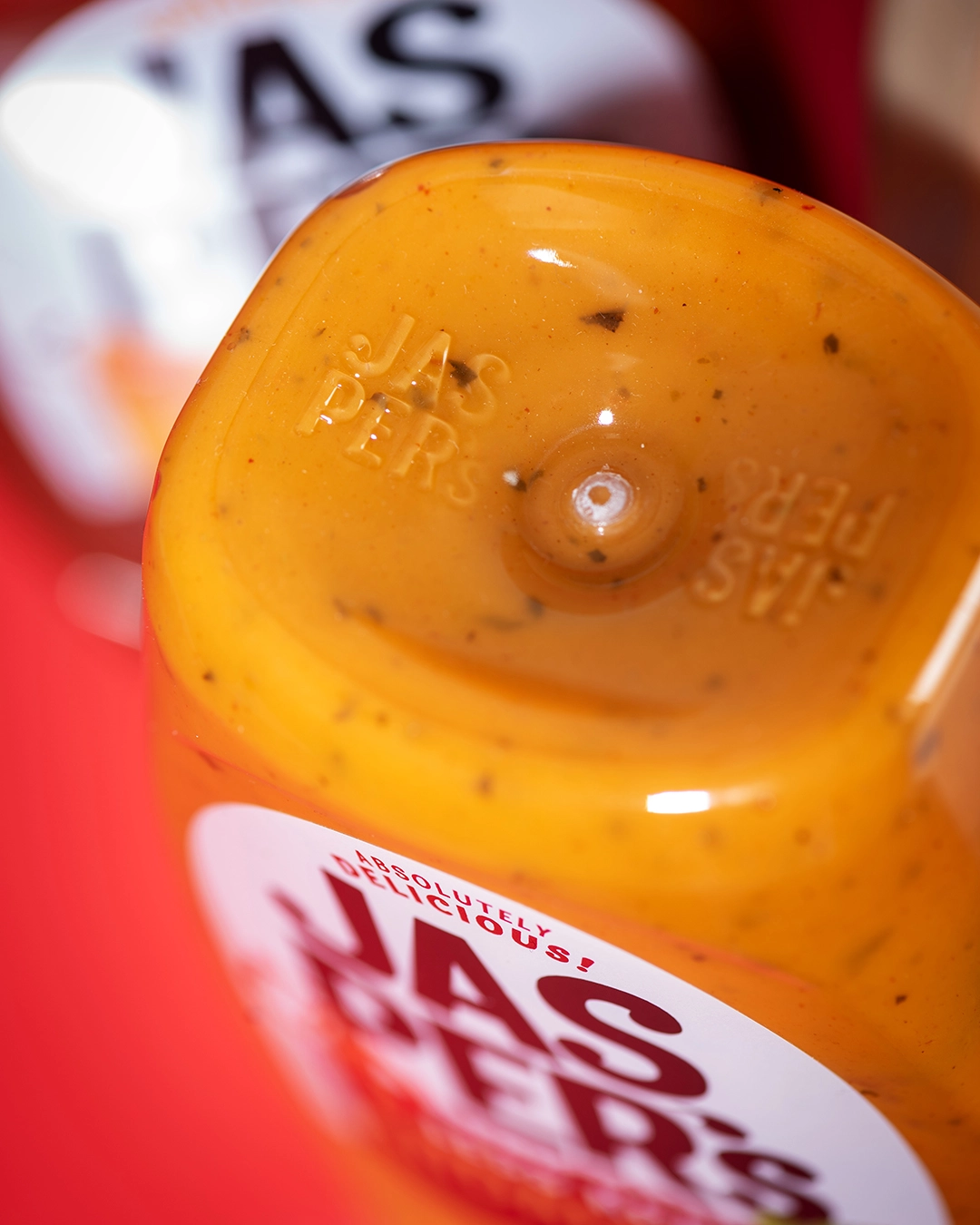
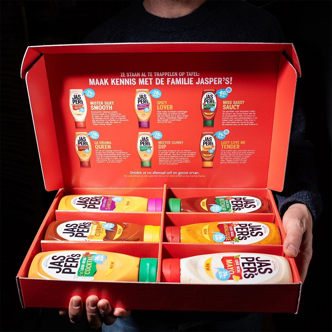
First of all we designed an ownable bottle shape for Jasper’s sauces — distinctive, modern, and impactful. Next to that, we created a packaging design that not only sparks taste excitement but also clearly communicates the product’s health benefits.
Jasper's six cold sauces with their recognisable flavours were transformed into an attractive family consisting of six flavourful designs with cheerful colours, a clear message and one important promise: fewer calories can actually be very tasty!
<div class="embed-2-images"</div>
<div class="three-images-vertical"></div>
<div class="embed-2-images"</div>
BRAND DESIGN
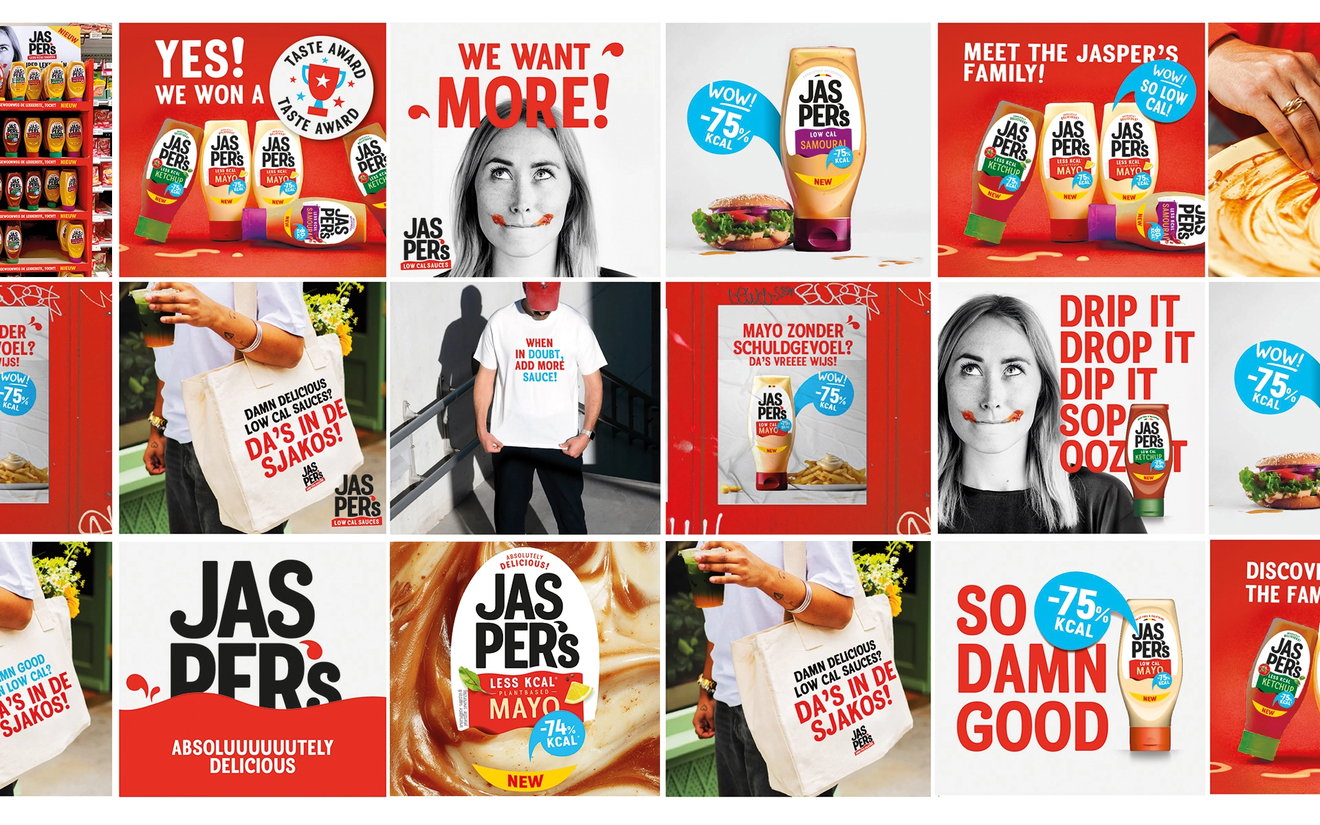
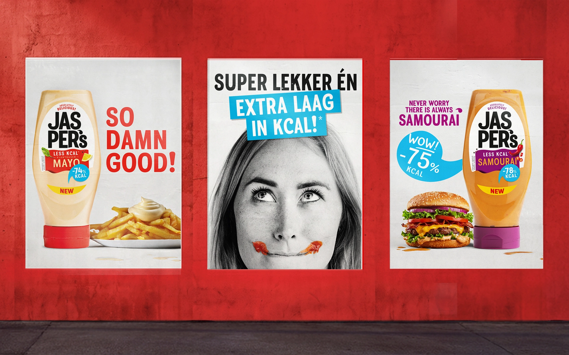
As a next-gen product aiming to redefine its category, the brand needed a look that screamed new energy. Being aware that a startup brand has only one chance to clearly and credibly communicate a complex message (read: really tasteful ànd low in kcal!) to its consumers, we knew we had to get it right.
So we brought together seemingly opposite worlds: boldness and warmth, energy and approachability, playfulness and trust. And of course, taste and low kcal. The result? A visual language full of life and attitude, anchored in quality and authenticity.
The logo evokes pride and confidence while the visual identity playfully winks at you. Even the tone of voice carries that spark: fresh, a little cheeky, but always genuine.
THE FUTURE
Today, Jasper and his partner-in-crime Guillaume are steadily expanding their tasteful empire. Within just a few months, they’ve managed to get their cold sauces on the shelves of a growing amount of retail locations.
The journey’s only just begun. But with taste, strategy and attitude on their side, the future’s looking bright.