<div class="content-width"</div>
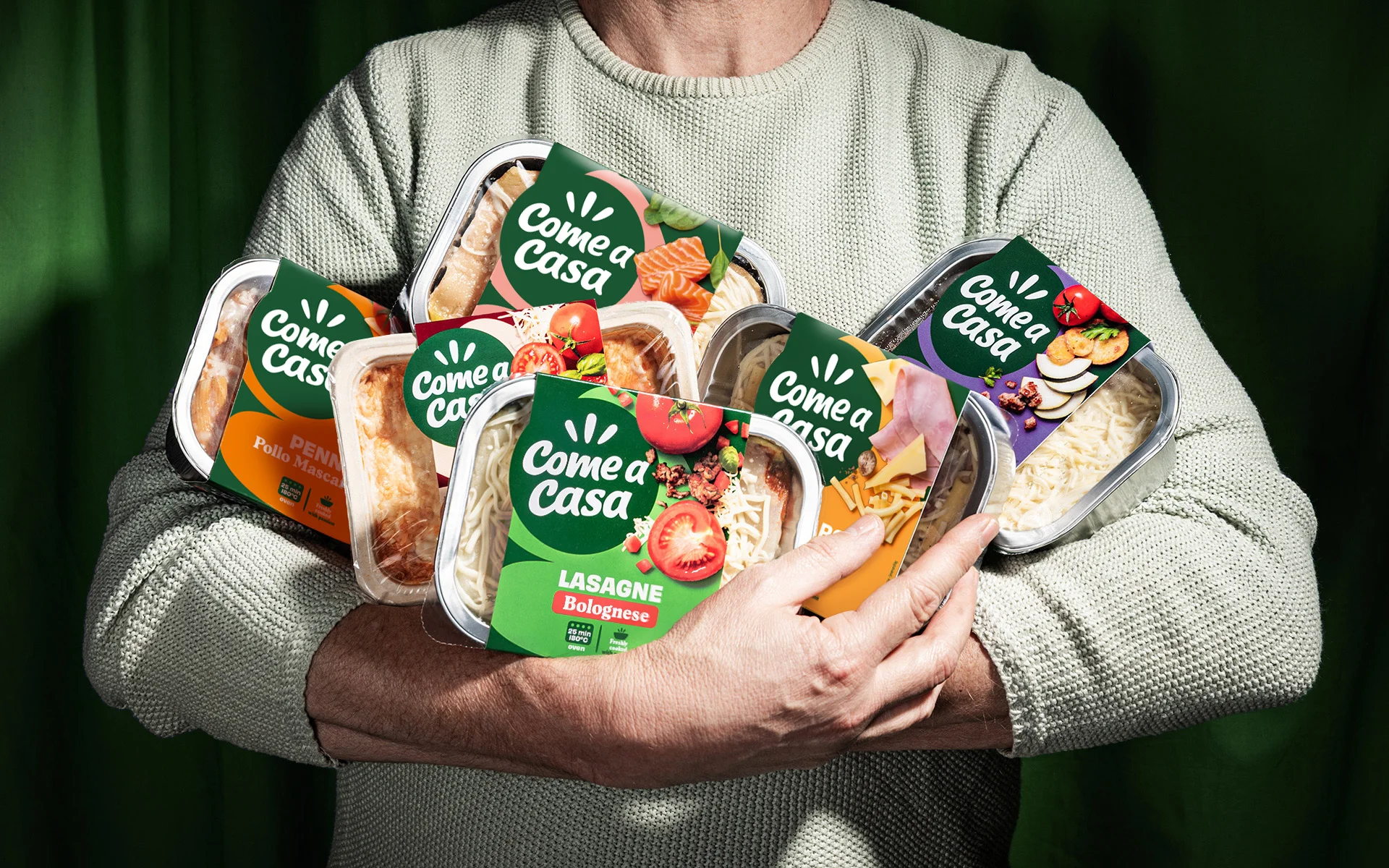
ONE GLOBAL BRAND ARCHITECTURE
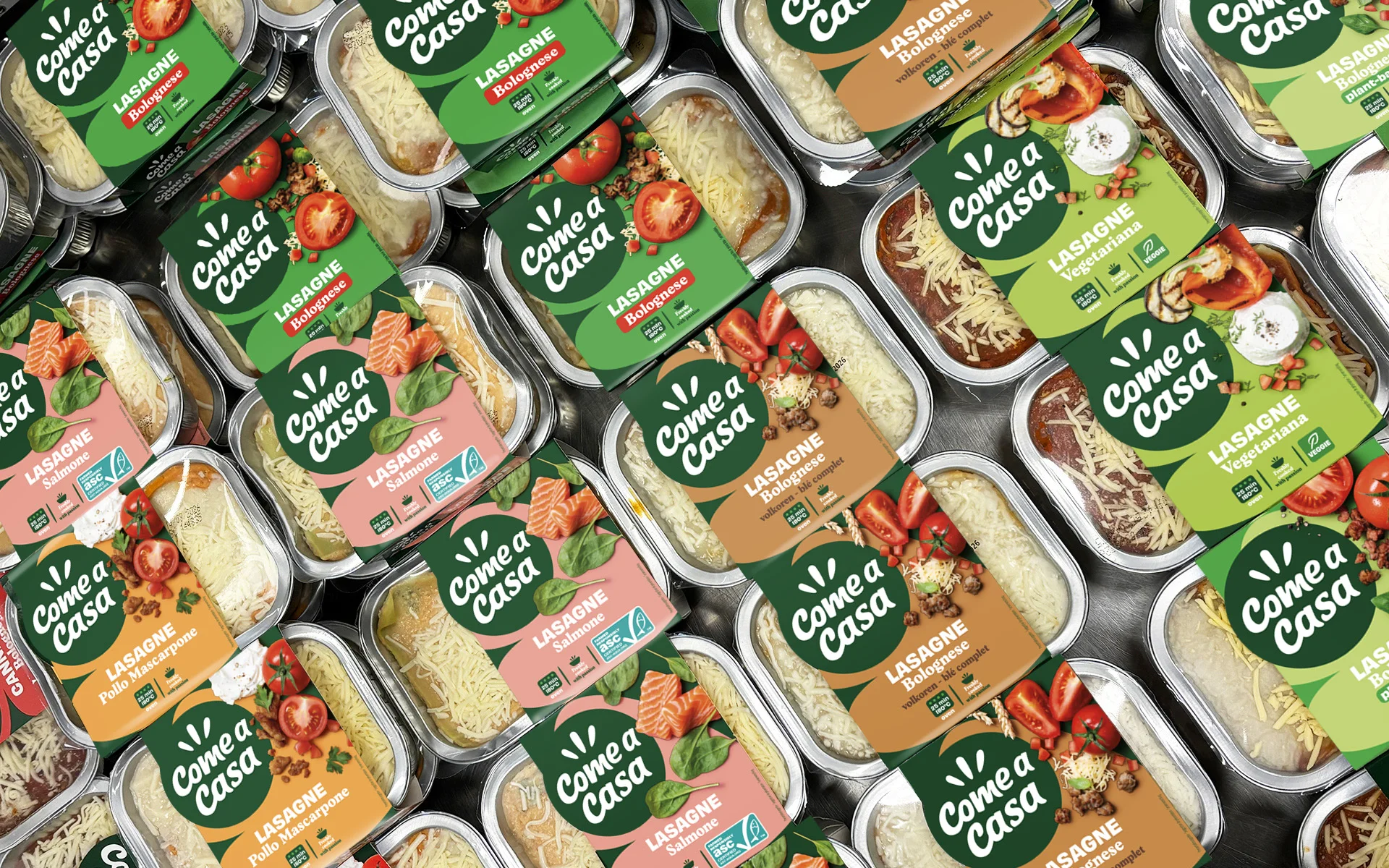
We dived deep to capture all the insights as there was a significant gap in brand perception. In Belgium, Come a casa had built strong brand awareness and category leadership. But in Central & Eastern Europe, consumers saw Come a casa simply as a range of tasty ready-meals, nothing more.
Time to bridge these worlds. We needed to create a one global packaging design that brings brand consistency across all regions, strengthens brand awareness, and tells one powerful brand story. The architecture delivers shelf impact through strong brand blocking, makes rolling out new ranges effortless, and guides consumers naturally through the versatile product portfolio.
<div class="bento"></div>
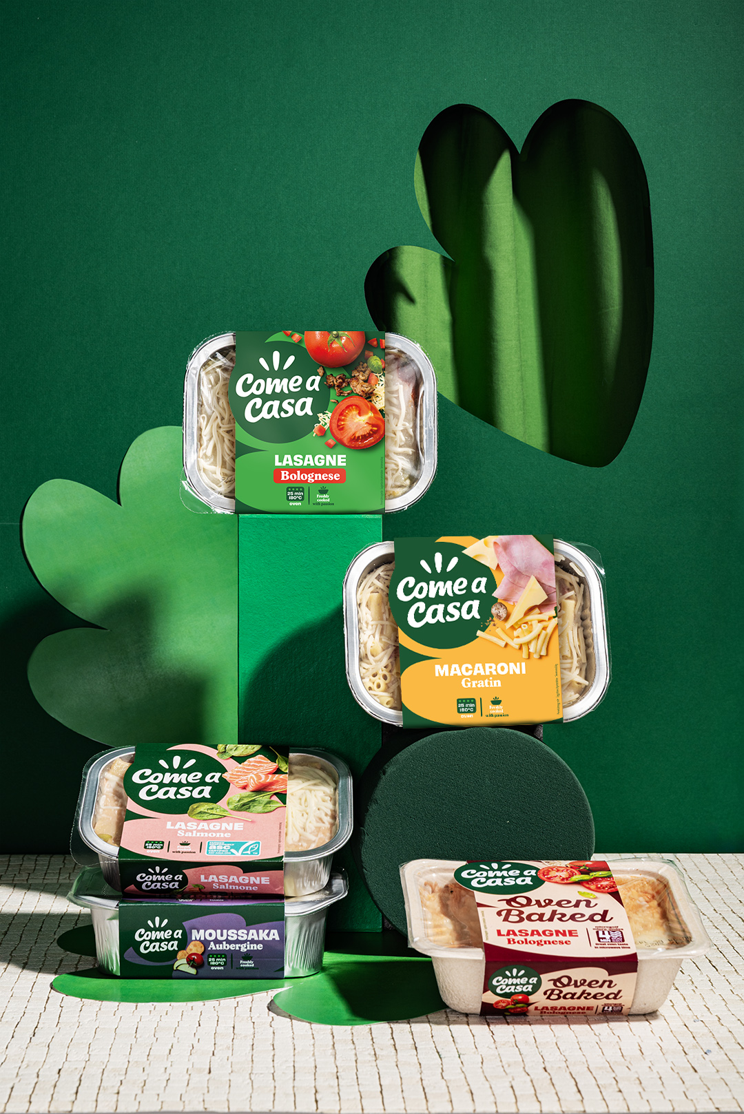
PACKAGING DESIGN
Two challenges stood in front of us. First: how do we translate this fresh visual identity into an exciting packaging that truly pops? Second: how do we stay true to the brand's visual DNA while creating something that resonates from Brussels to Warsaw and Bucharest? Our answer? We went back to basics. Simplified. Amplified. We cut through the clutter and let the essential shine through.
We created a contemporary, dynamic packaging design that does double duty. For Belgian consumers, it keeps the strong brand recognition they know and love: fresh, indulgent products that feel familiar. We kept the playfulness: bright colors and fresh photography but visualized in its purest form. For European markets, we channeled the boldness and taste appeal into a powerful packaging language that resonates across borders and cultures.
<div class="content-width"</div>
“Catchafish is a strong, long lasting and reliable partner for us: professional, collaborative, and with a strong client-agency relationship. We entrust our large projects to them with complete confidence."
Margaux De Ridder - Brand manager Come a casa
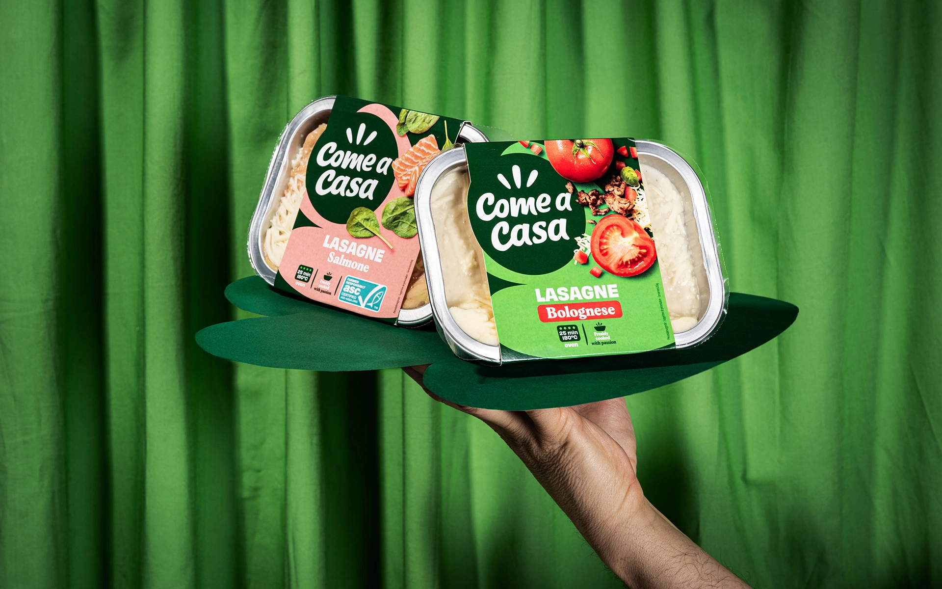
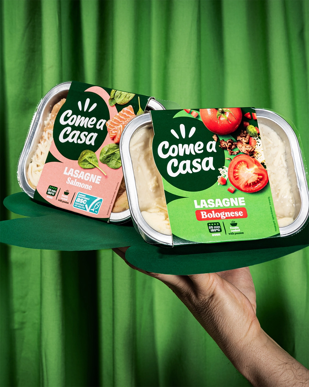
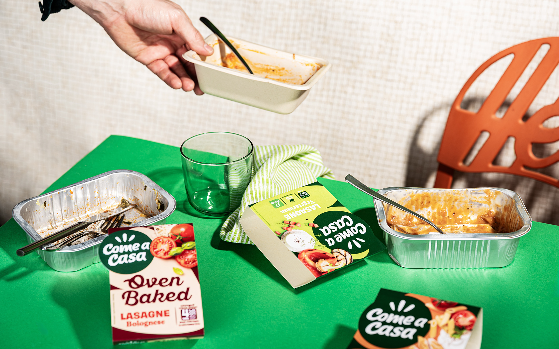
SUSTAINABILITY VALUES
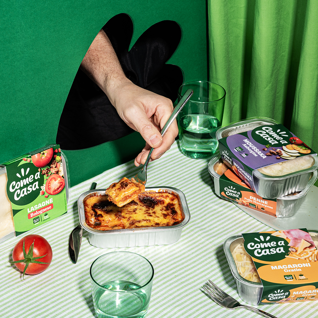
To honor the brand's sustainability commitments, a brave move was made: the plastic blister was ditched and replaced with a single aluminum tray. Out went the printed topfilm. In came a clean cardboard sleeve. This wasn’t just a big eco-win, it unlocked a visual breakthrough. Suddenly, we were able to communicate in a more compact and clean way, while the fresh food could take on a bigger part of the storytelling. The result? A new packaging that doesn’t just sit on the shelf. It stands out even more, reaching out to consumer all over Europe and pushing Come a casa further ahead in the category