STRATEGY
Strategic sessions organized by Àfond with the Ginstberg team, on which Catchafish built with even more strategic insights, gave grounded insights and direction to start design work from. Rather than chasing new sales volumes in channels, data pointed to untapped potential for Ginstberg's customer base. Production volumes were good, the problem was the brand experience. That insight made clear this wasn't a case for reinvention, but for rediscovery.
Catchafish built on recognisability, simplicity and its unique family history and credibility. Mapped against other water brands, Ginstberg’s ambition to sit slightly higher on the premium ladder would work if this brand's genuine uniqueness was put to work.
BRANDING & PACKAGING DESIGN
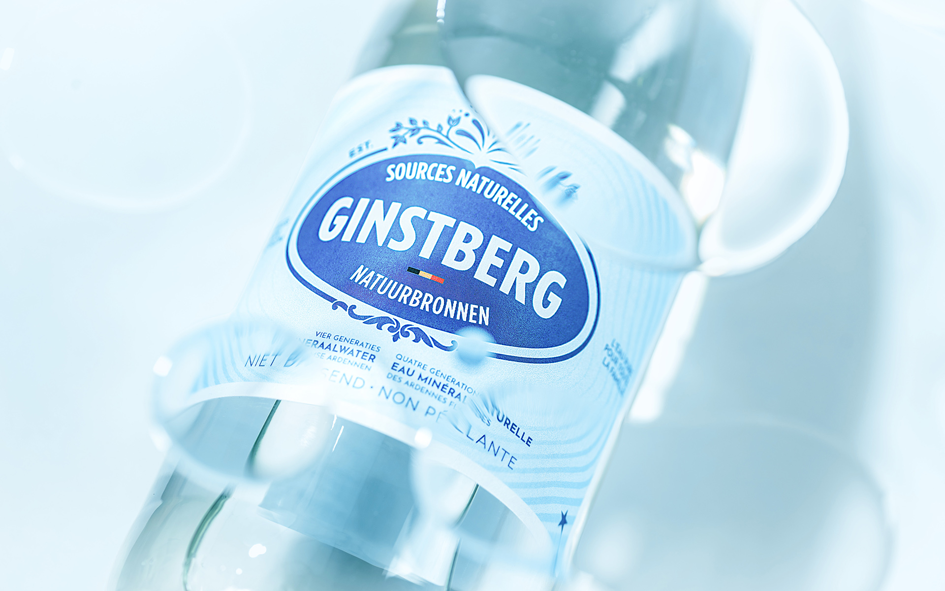
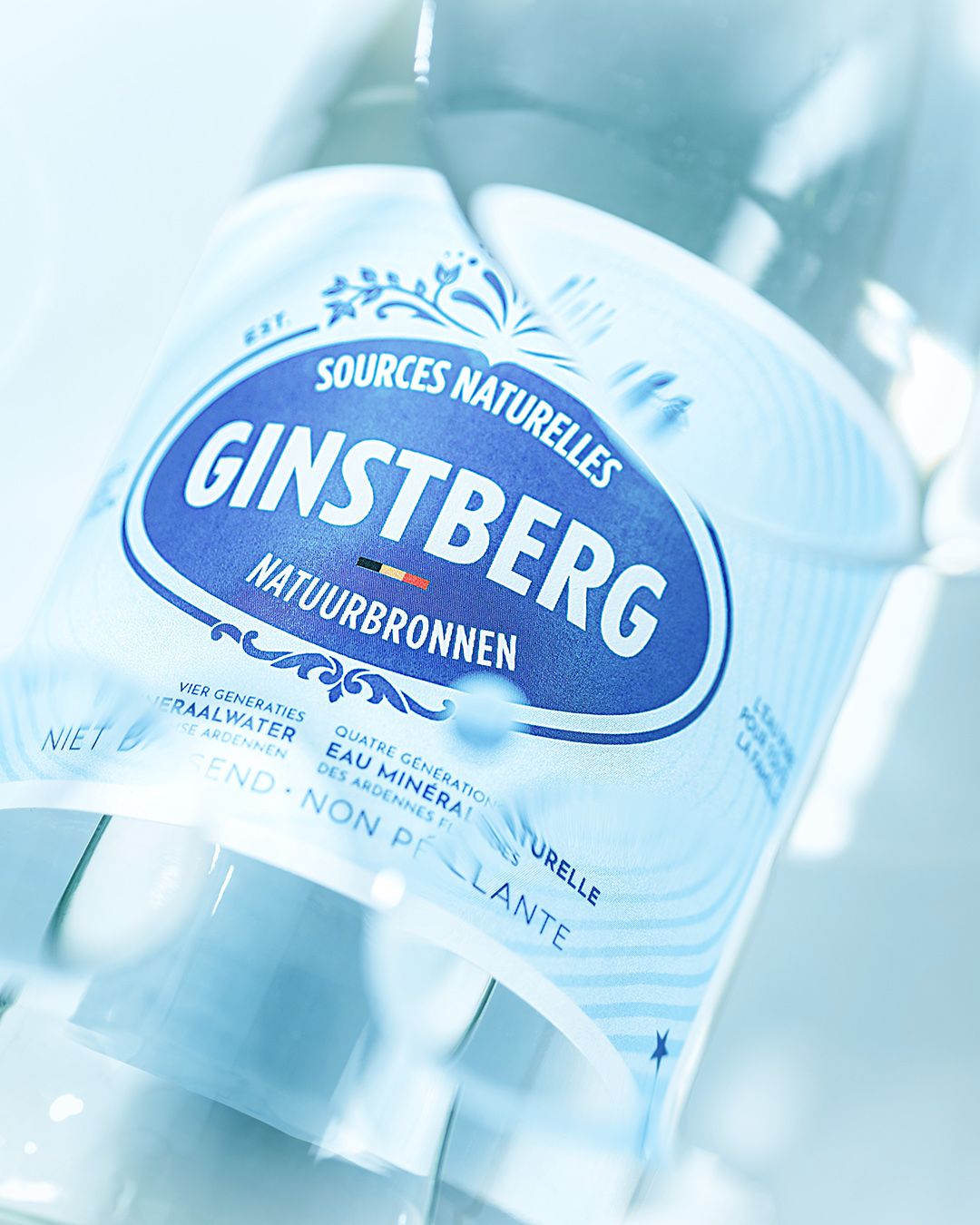
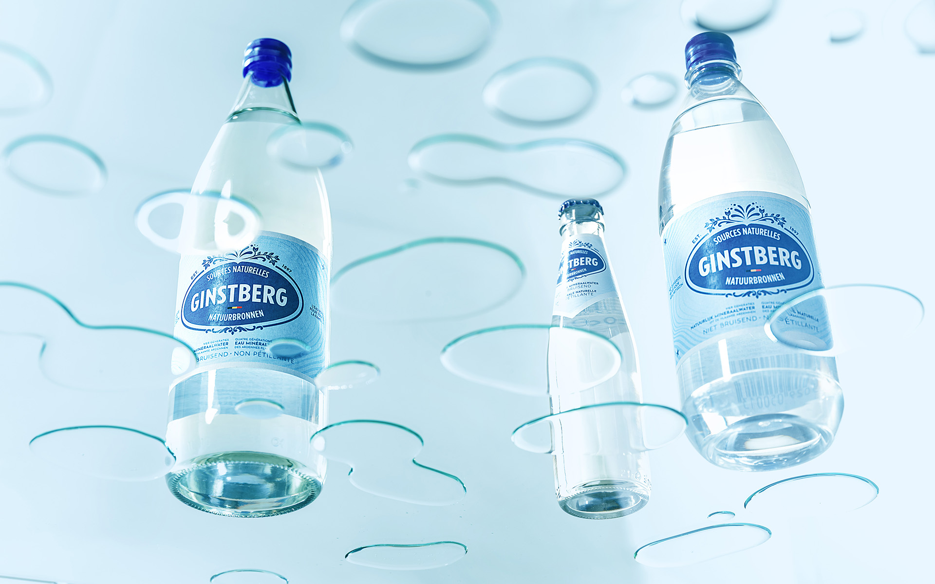
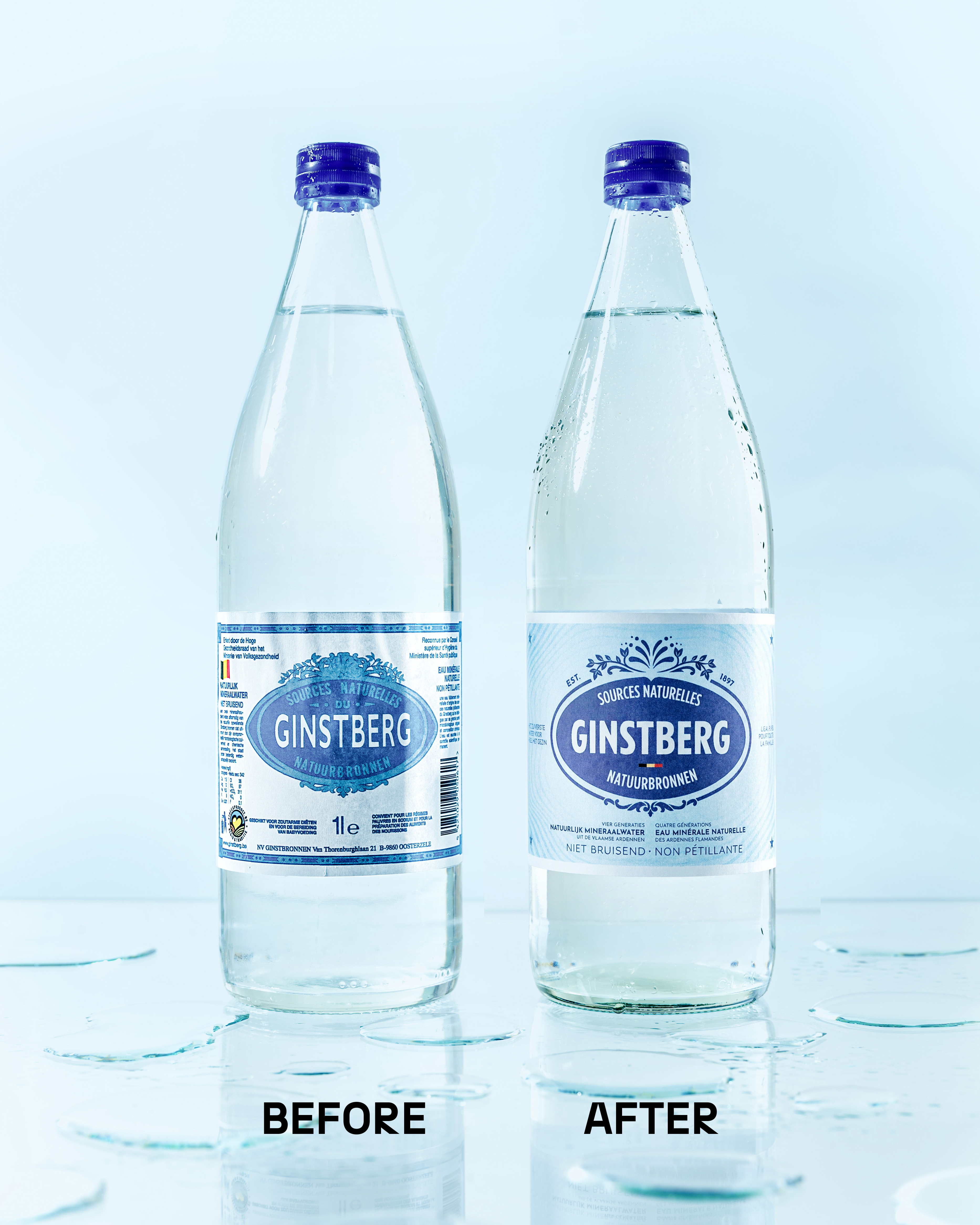
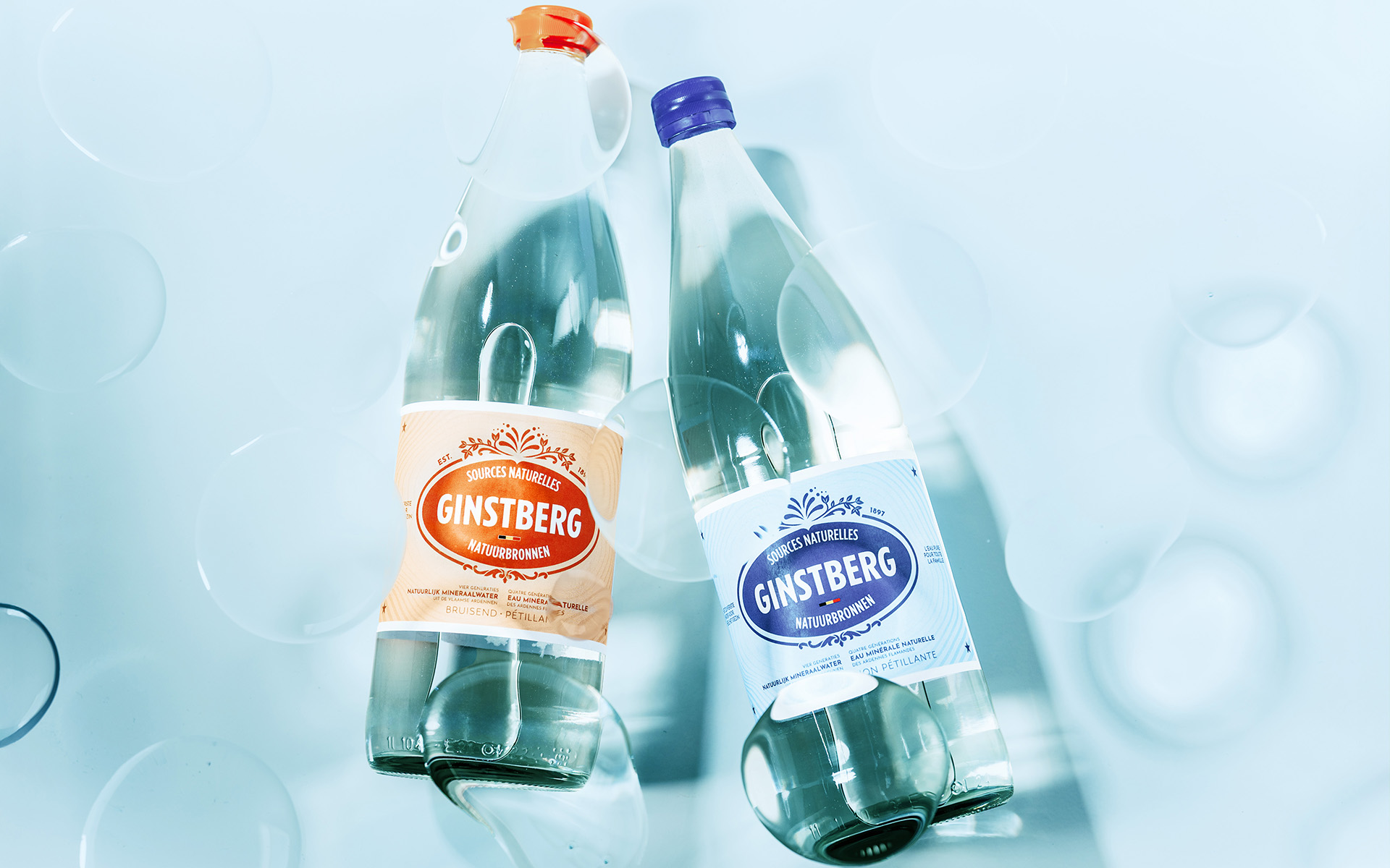
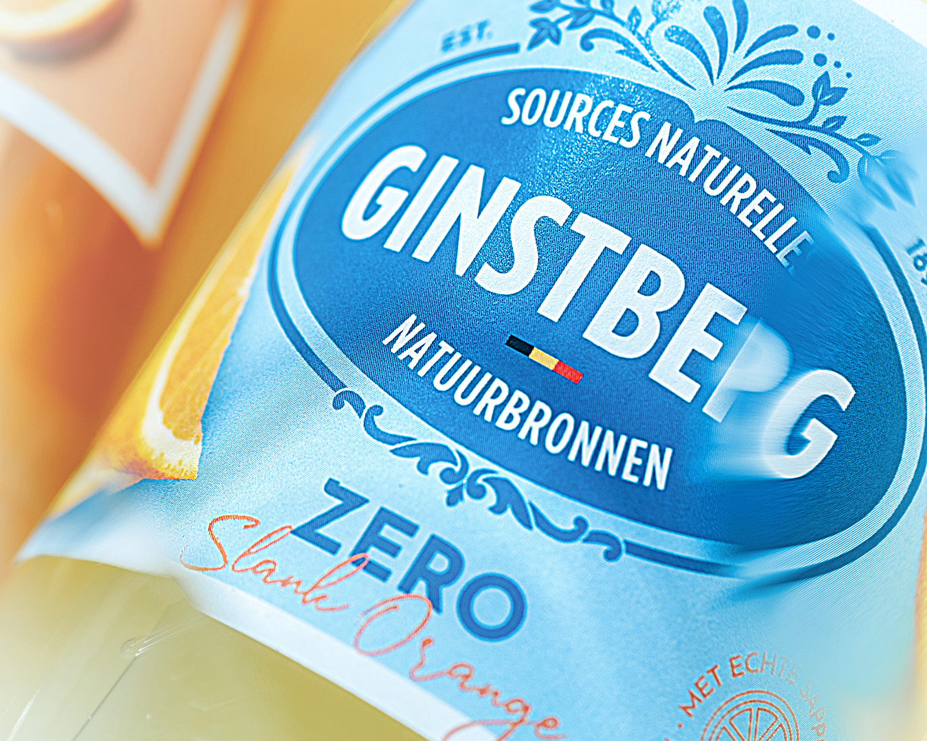
The brand became hero. The existing oval emblem with a modernized typography stayed at the heart of the redesign, but sharpened. "EST." and "1897" now frame the top of the badge, a Belgian flag was woven in with care, and the claim "four generations of natural mineral water from the Flemish Ardennes" earned its place front and centre.
We tested the frame around the emblem intensely. Bringing back the full ornamental border made the design feel busy and pushed the brand itself into the background. The breakthrough came from a different question entirely: what does Ginstberg's own story look like, visually? We created a natural water ring, rippling outward from the very heart of the label, with the emblem placed at its centre, echoing both the spring and the four generations it has carried forward.
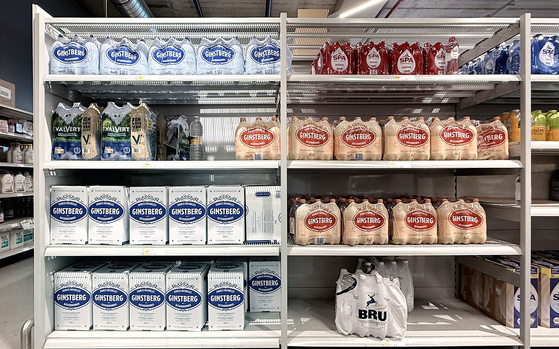
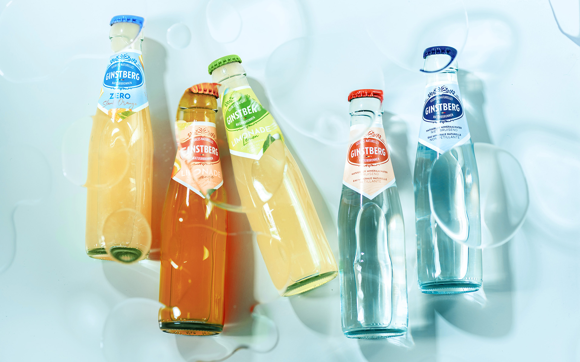
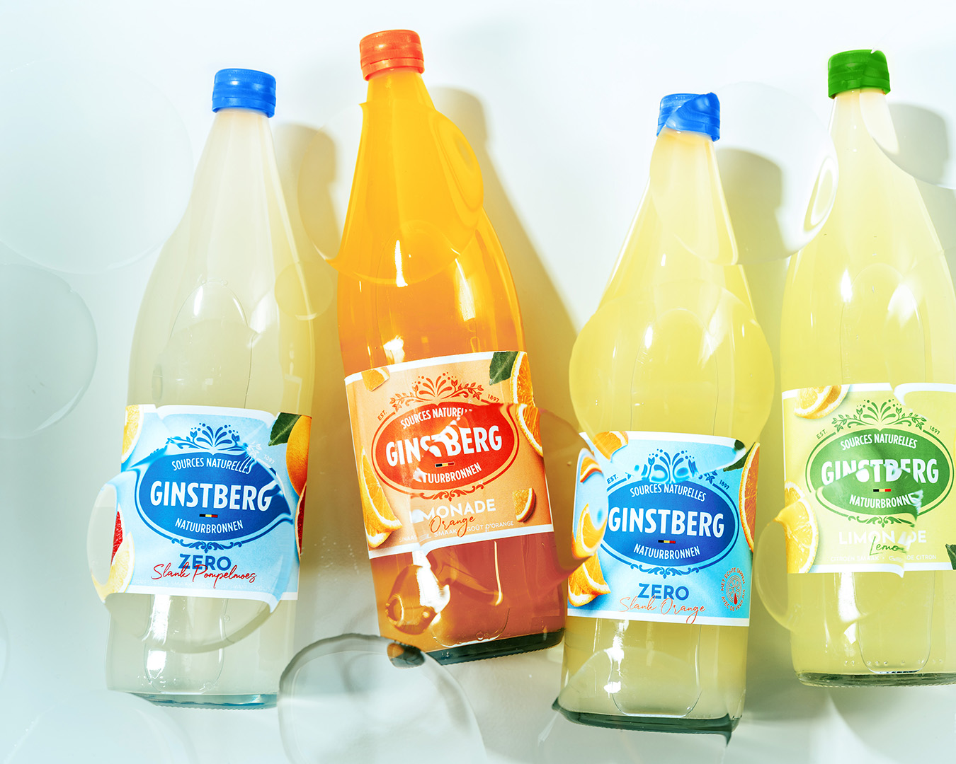
Applied across the full range, plain and sparkling water, lemon and orange lemonade, Zero Orange, the result now reads as one coherent family, whatever the format.
<div class="embed-2-images"</div>
<div class="content-width"</div>
<div class="embed-2-images"</div>
<div class="content-width"</div>

A CONSISTENT FUTURE
With one identity finally holding the full assortment together, Ginstberg has the structural foundation to keep building: strengthening its position in existing B2B and B2C channels where growth potential is there, giving room for expansion if wanted, and opening the door to future product innovation without ever fragmenting the brand again.