<div class="content-width"</div>
MAKING CIRCULAR FEEL PERSONAL
Together with the Woosh team and Jolien from Eat The Cake, we looked at what consumers really expect from a diaper brand. One thing quickly became clear: parents don’t buy a circular system. They buy the reassurance that their baby will feel comfortable, protected and happy. So we started with what matters most to parents.
Comfort, softness and trust moved to the front. Circularity remained a key part of the brand, but became part of a broader and more human story. Because Woosh isn’t only about recycling diapers. It’s about helping a new generation of parents make better choices for themselves and generations to come, one small step at a time.
GIVING GIVE-BACK ITS OWN LANGUAGE
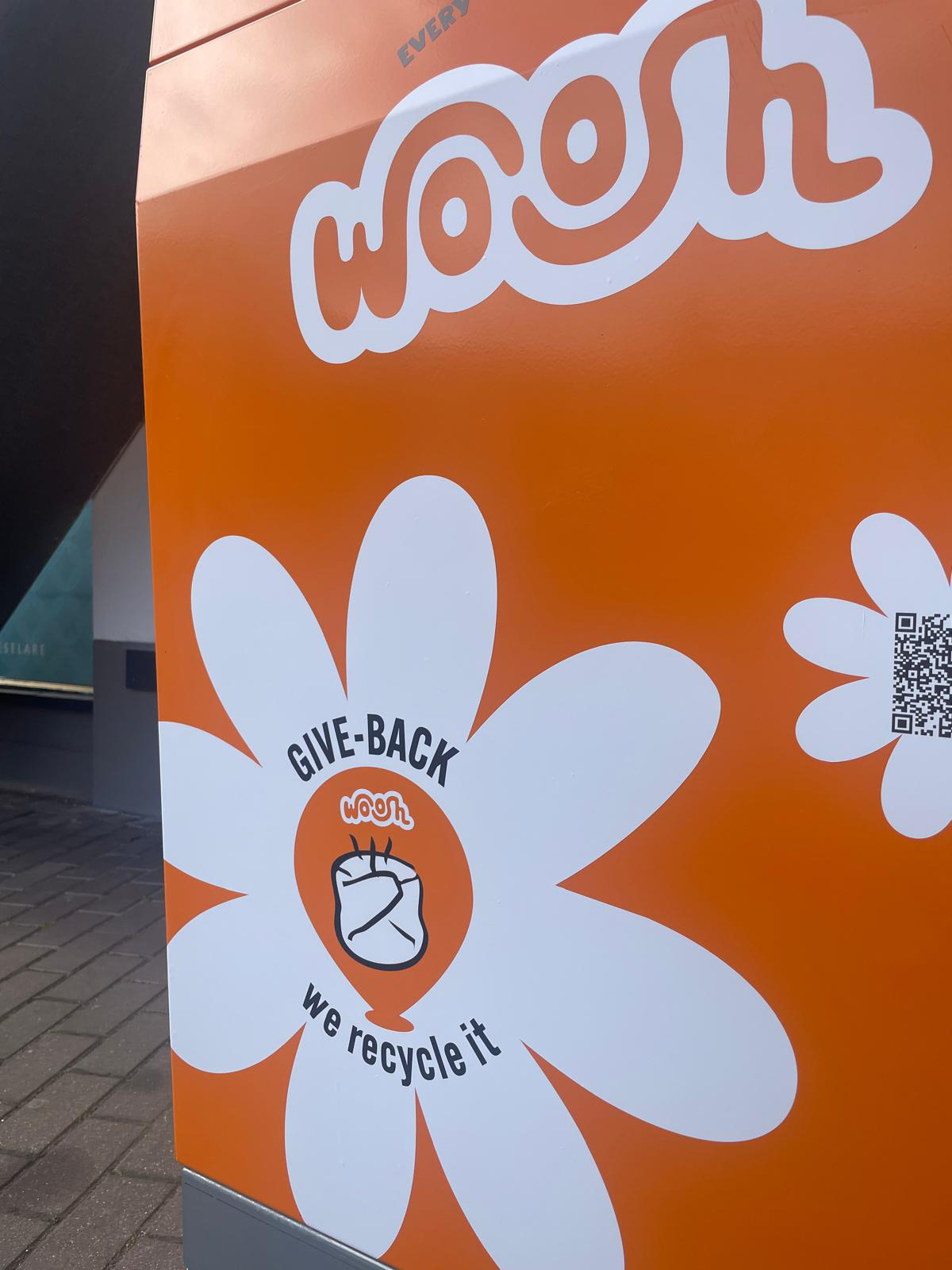
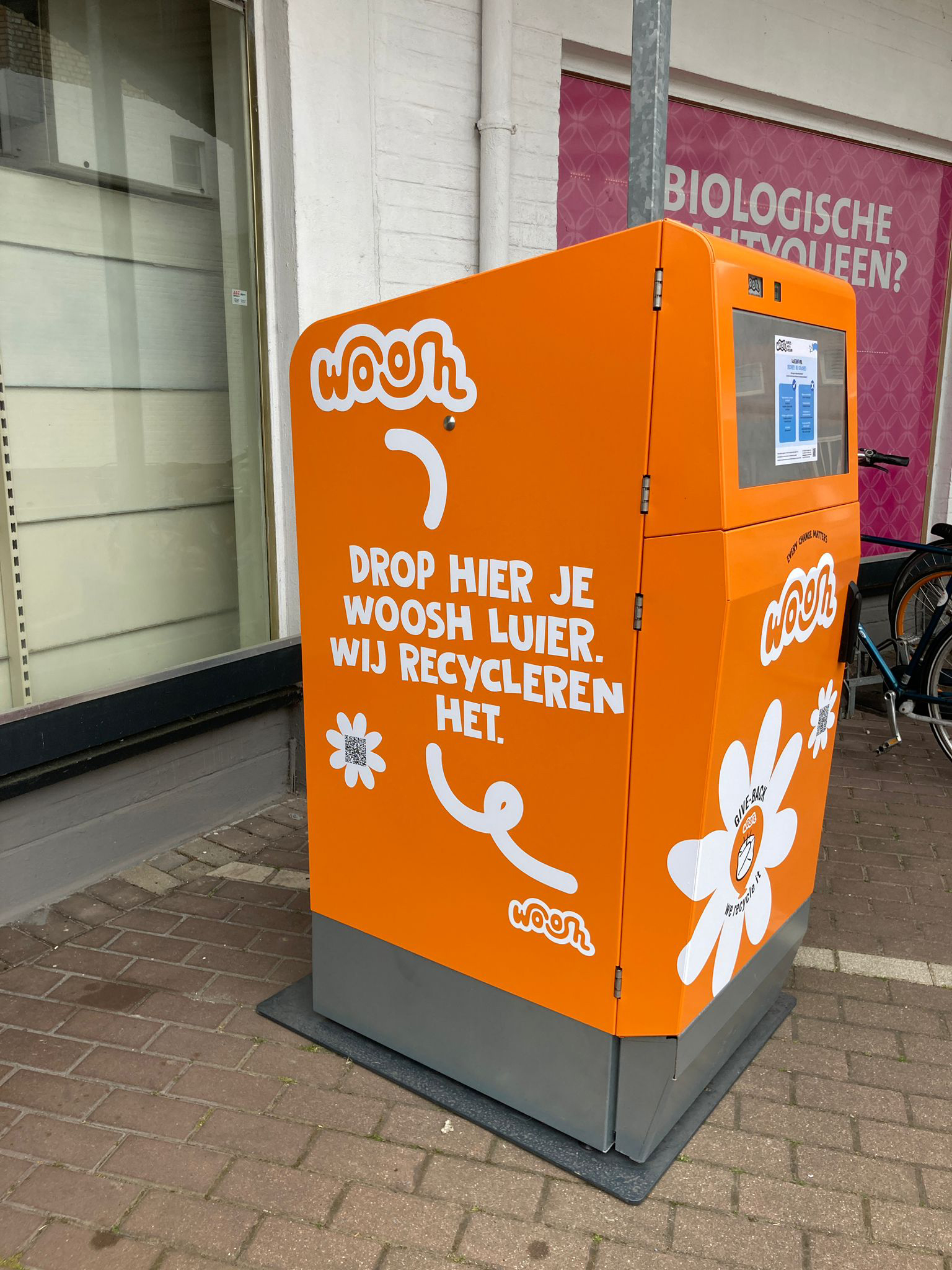
Woosh has a powerful circular system. But in retail, a powerful story also needs to be easy to understand. So we made it easier to grasp. The Woosh circular story got its own name: Give-Back. A simple call to action that fits the energy of Woosh and turns a complex system into something people can instantly understand.
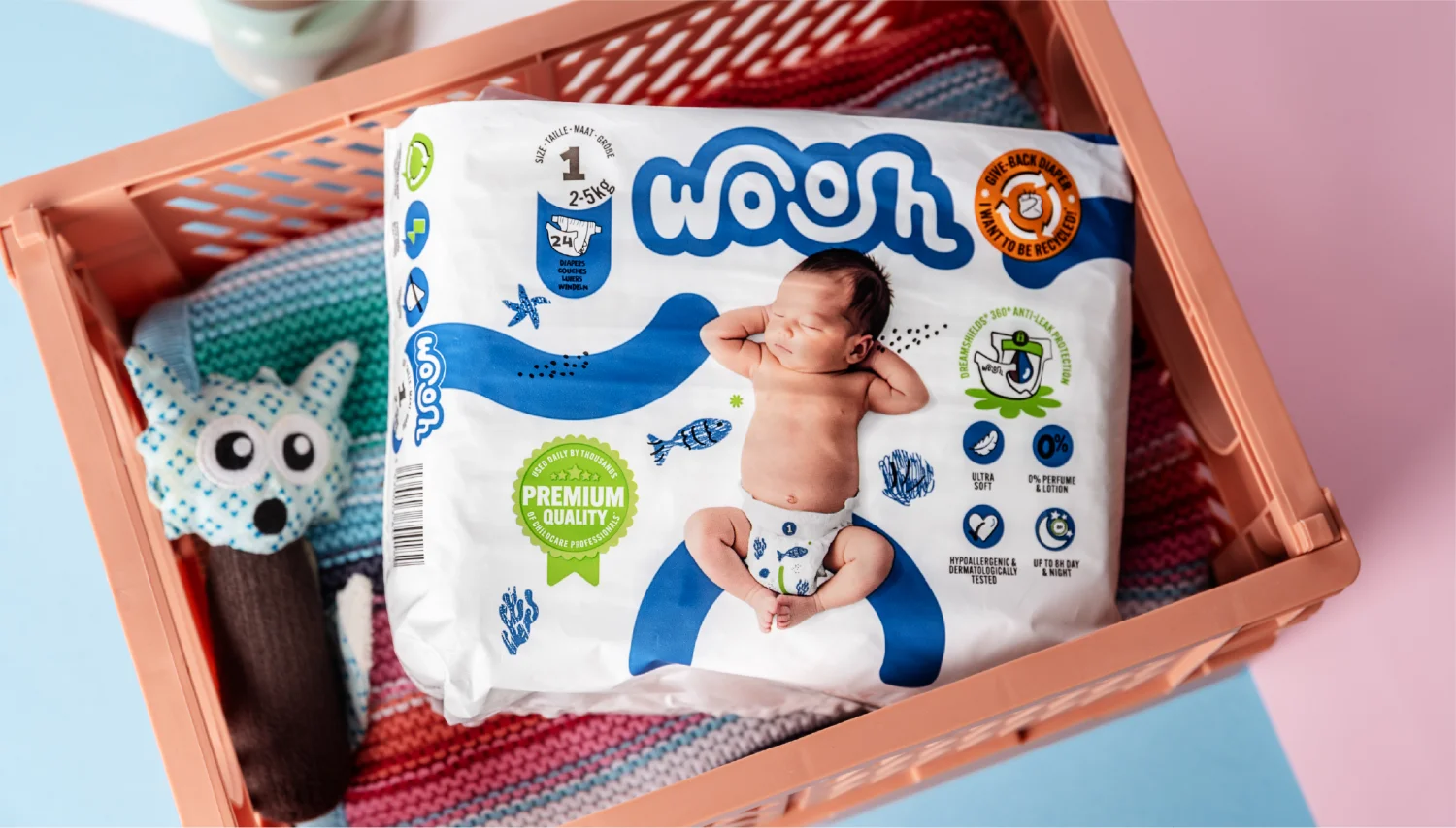
We also gave Give-Back its own visual code within Woosh’s already colourful and positive brand world. Orange, linked to the Woosh collection bins on the parking lots, became the new colour of circularity. A distinctive dot that appears across packaging, instore communication and activations. A simple device with a clear role: making the circular promise visible wherever Woosh shows up.
<div class="embed-2-images"</div>
IMPACT FOR THE SHELF
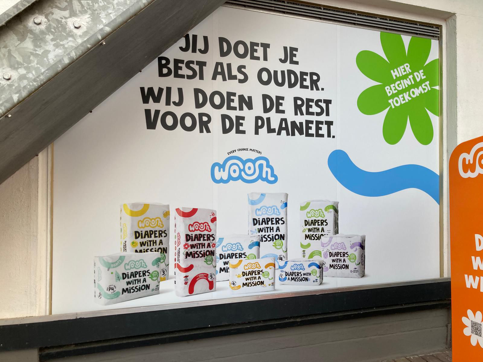
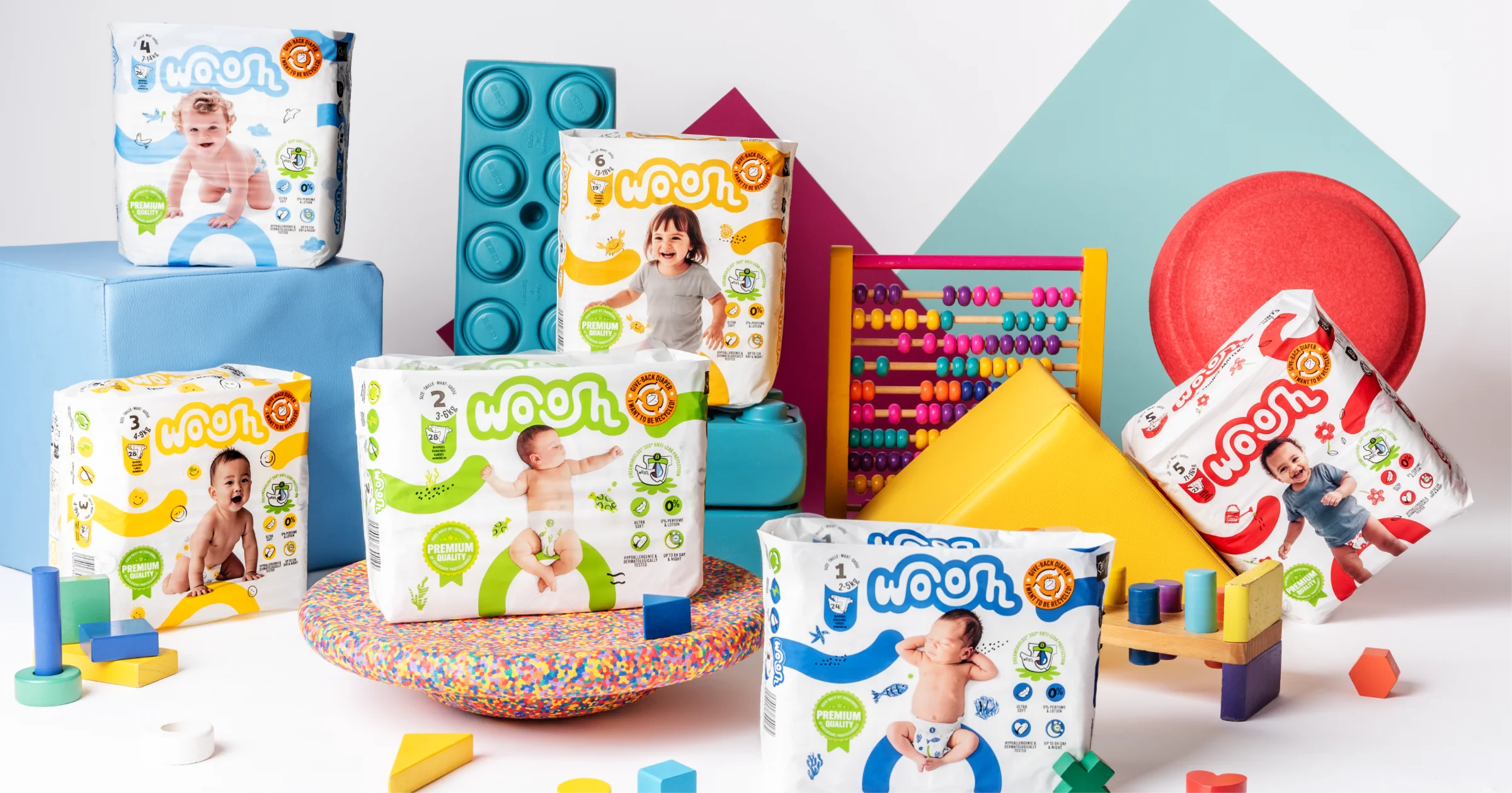
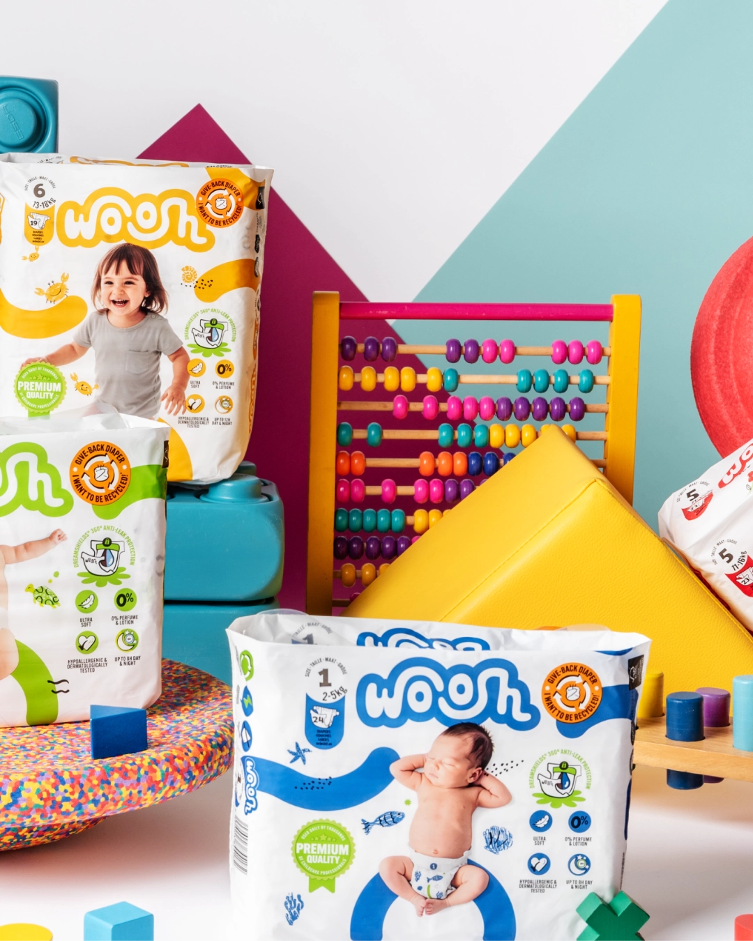
The biggest shift happened on pack. Originally designed for a B2B environment, the packaging now had to work in a completely different reality: a busy retail shelf, where attention is limited and choices are made in seconds. So we rebuilt the communication hierarchy from the ground up.
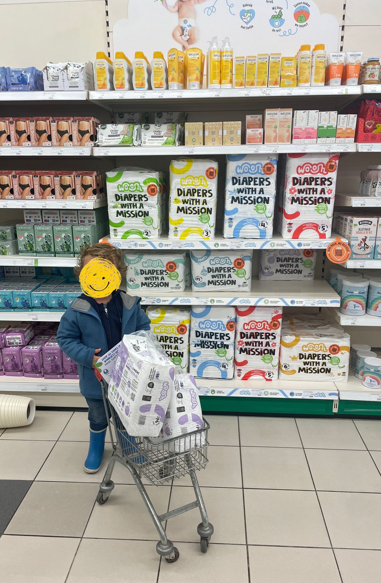
Authentic, cheerful babies and toddlers became central to the design, bringing warmth, recognition and trust to the front of pack. Claims and icons were reconsidered from the consumer’s perspective. Safety, softness, reliability and comfort were given a clearer place, with a deliberate distinction between what needs to communicate instantly and what can be explained further on pack. The Premium Quality stamp was redesigned in the own Woosh language. And the Give-Back dot was given a prominent position on front.
The result is a packaging that feels instantly reassuring, yet distinctive enough to stand out as unmistakably Woosh, true to its mission.
<div class="two-images-fullscreen"></div>
"What started as sharp research became a clear strategy, and a pack that perfectly tells the story of what Woosh stands for. They think along with you, hit impossible deadlines with a smile, and the result simply jumps off the shelf. It's the kind of collaboration you wish for everyone."
Lies JackXens - Marketing manager Woosh
STEPPING INTO THE RETAIL ARENA.
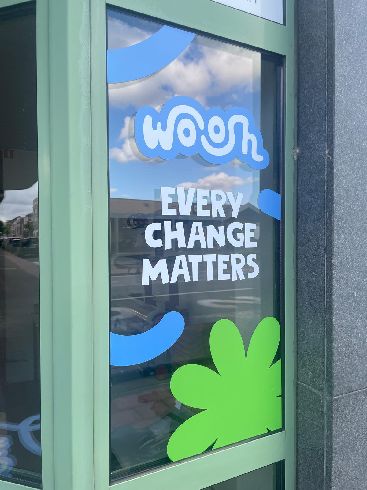
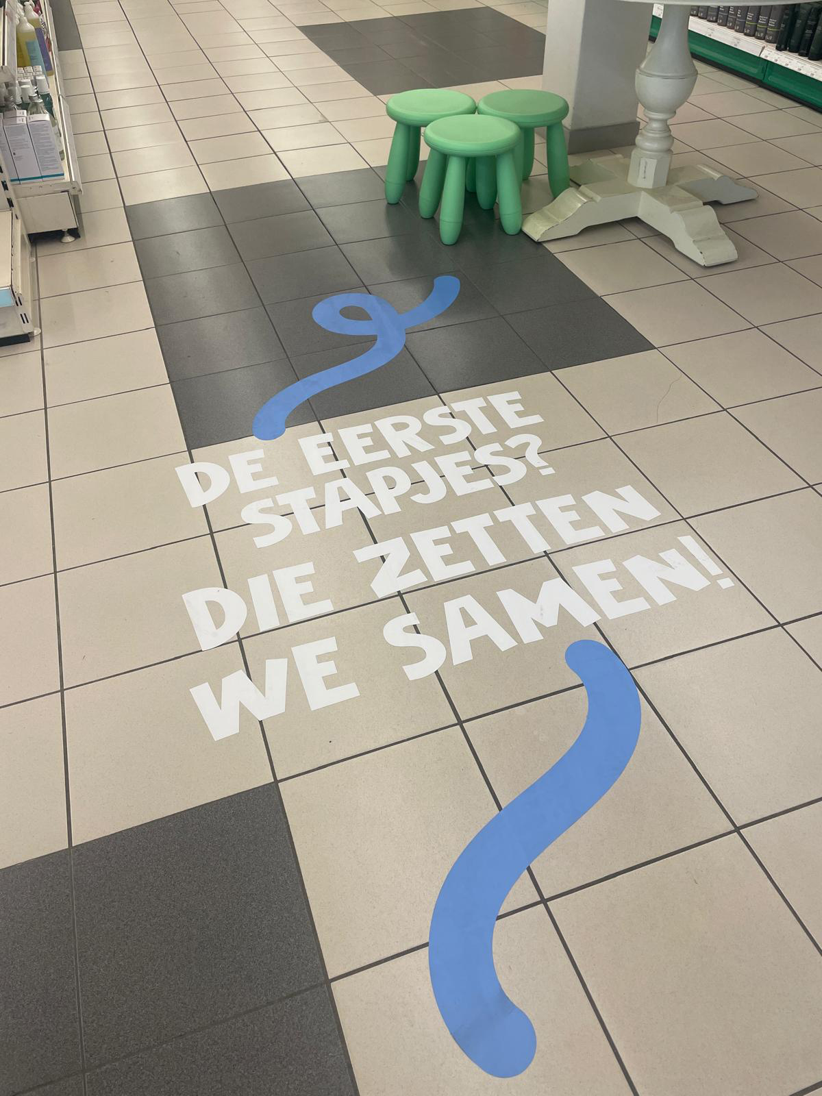
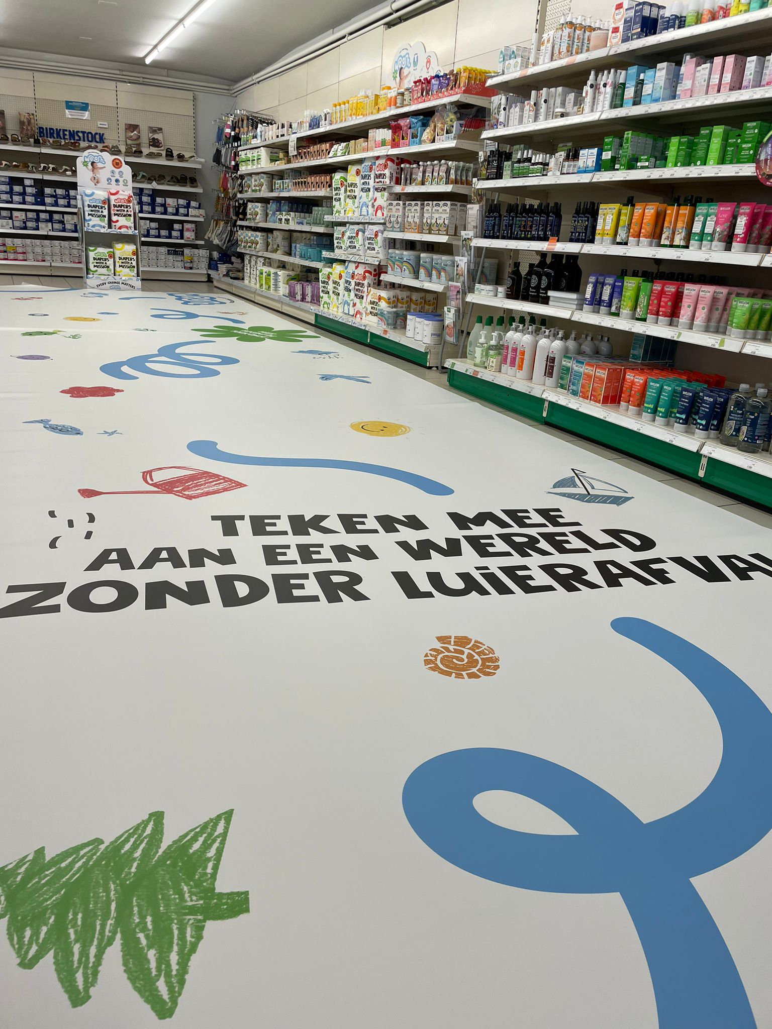
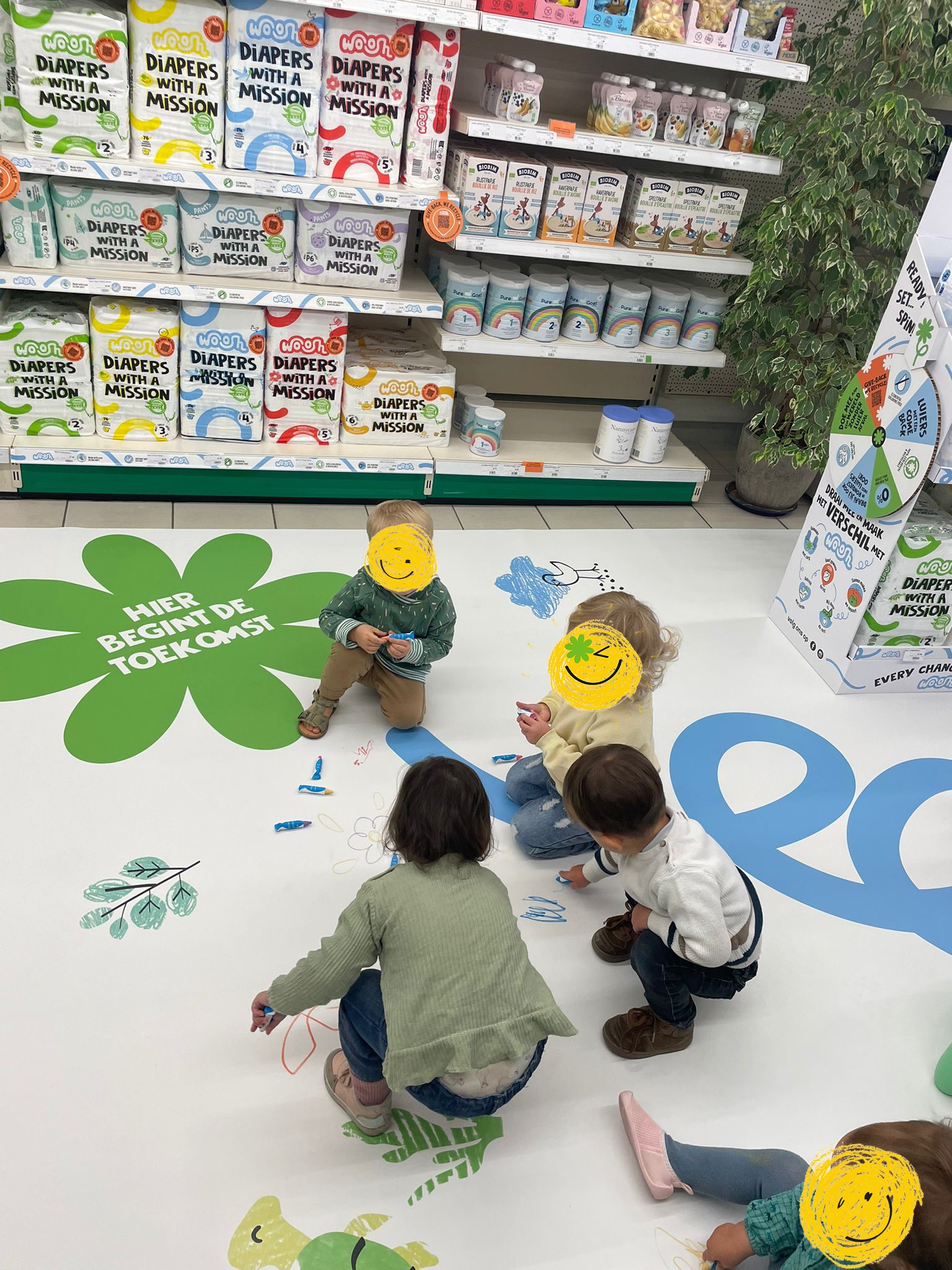
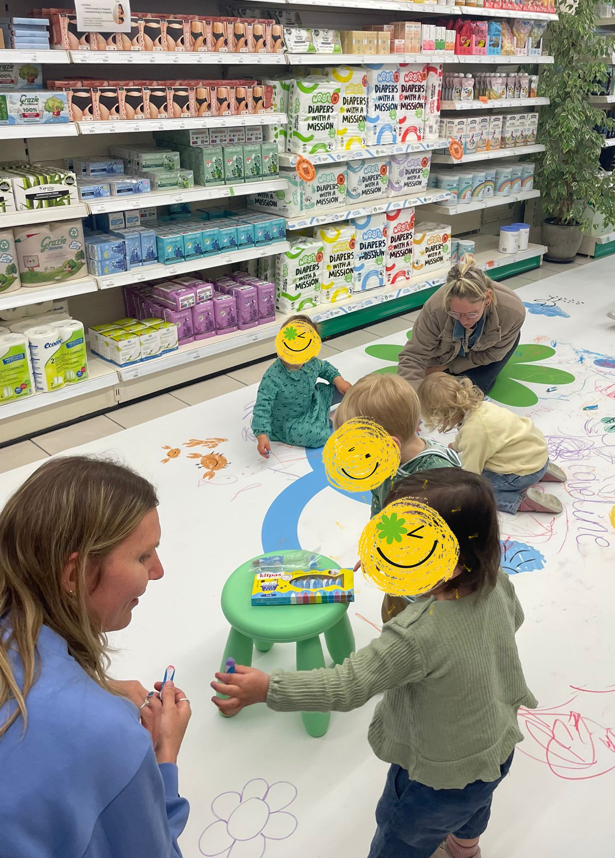
The first retail introduction at Biovita gave Woosh a first opportunity to tell its story directly to consumers. Simply putting the packs on shelf wasn’t enough. So we brought the positive, playful and ambitious Woosh world into the store. The idea? Big change starts with small steps. And who better to imagine a better future than the children who will grow up in it?
For one day, kids took over the store. With drawings, ideas and imagination, they became co-builders of a new world without diaper waste. Their creations became part of the instore experience, turning Woosh’s circular ambition into something tangible, optimistic and fun. On that day, the store became more than a place to buy diapers. It became a place where the Woosh story came to life. Curious. Positive. Full of energy. Exactly like Woosh.
The launch was designed to create buzz, in store, in the press and online. And it did, giving Woosh valuable exposure for its full-scale retail ambitions.