
STRATEGY
Together with the people of Gudrun, we built a sustainable-proof strategy and created a dedicated platform, MORE, nested under the Gudrun umbrella. This became the perfect stage to communicate their powerful vision and ambitious sustainable mission.
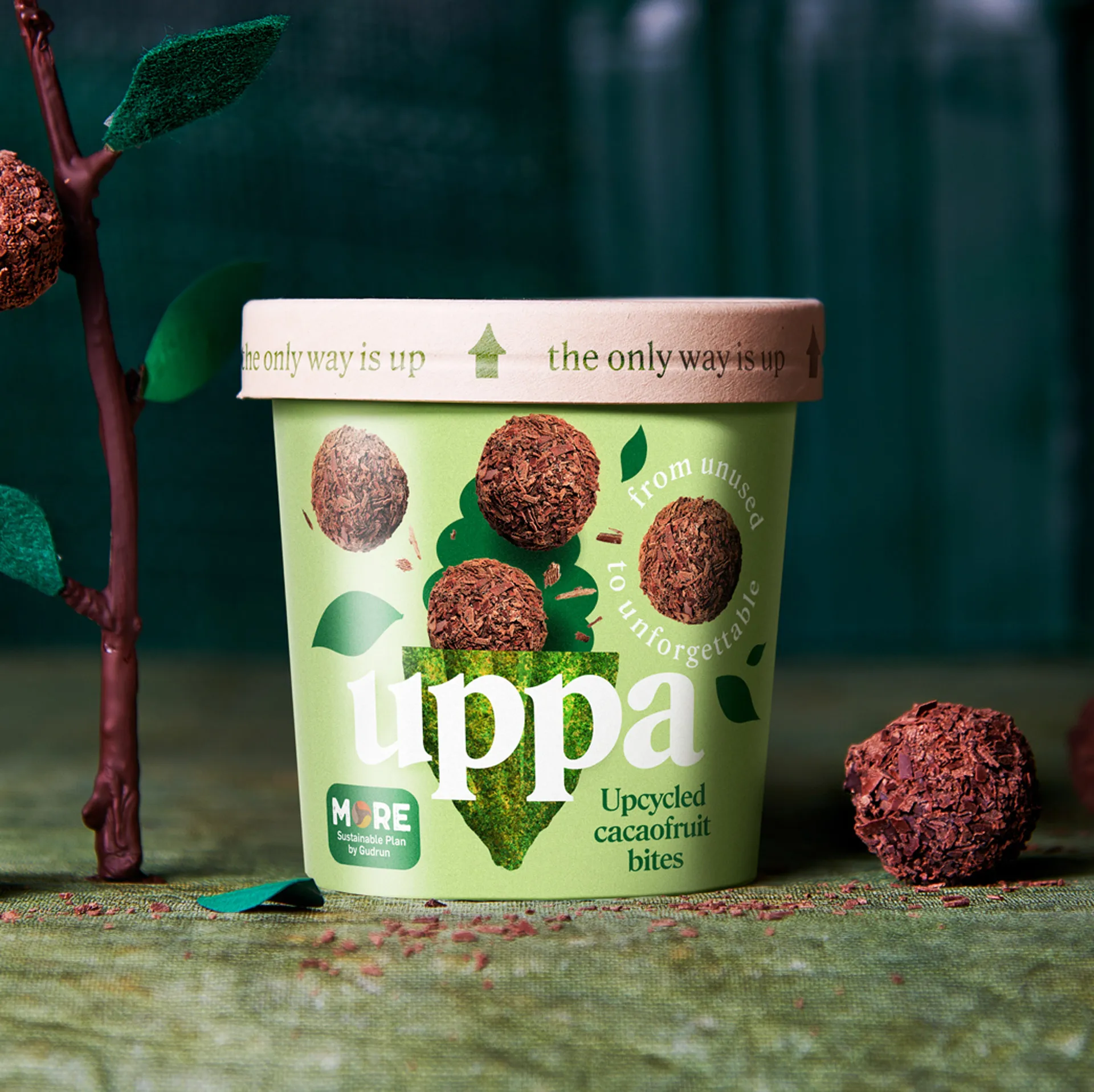
In this context Uppa was born, a fresh retail brand designed to unleash their innovative upcycled chocolate bites on the world. We worked side by side with Gudrun, steering them towards the right direction to ensure the best possible impact in the global market for this inspiring new product.
BRANDING & BRAND NAME
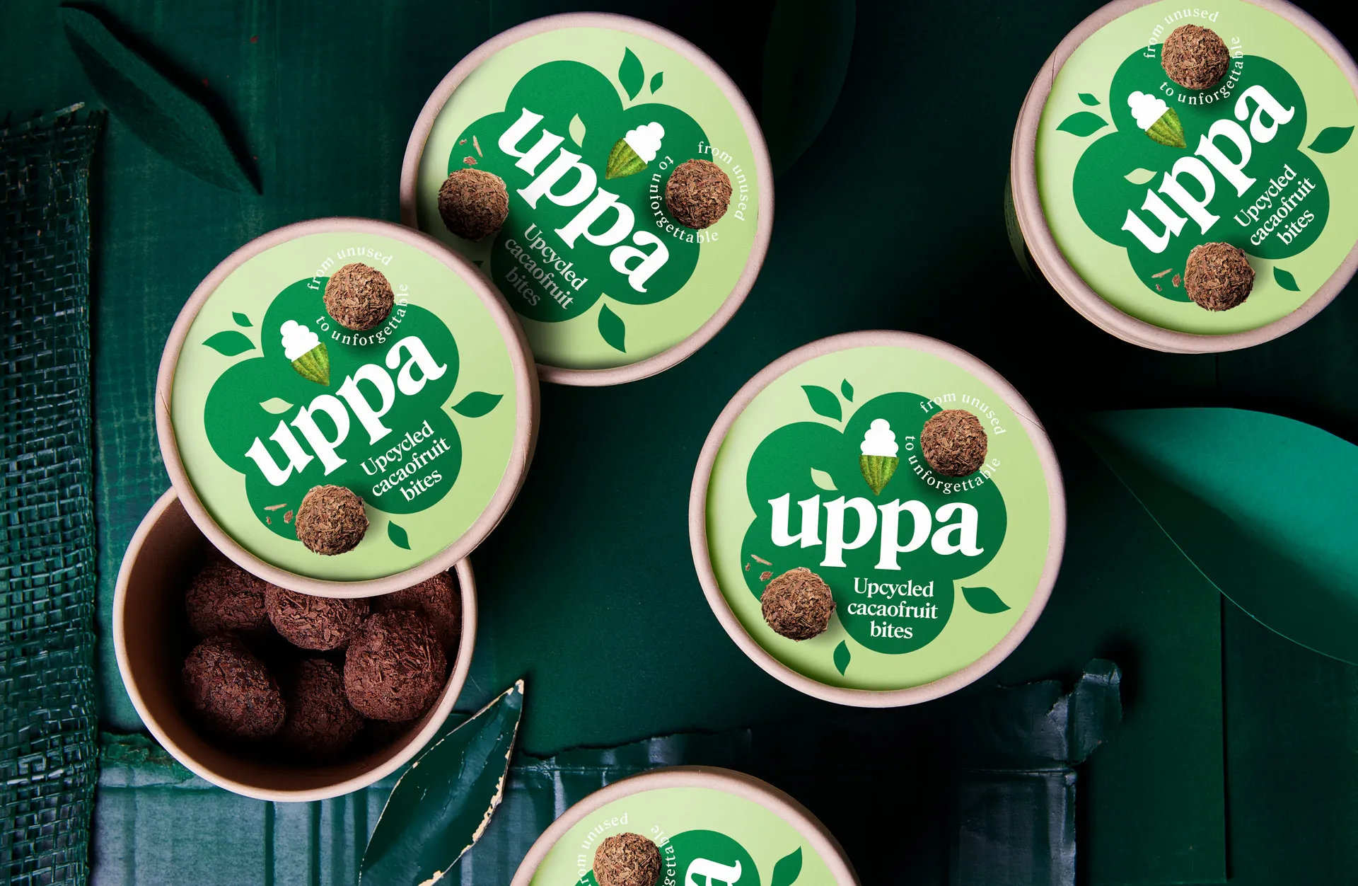
Catchafish created a stand out brand that could fully communicate this exciting story. We wanted to bring a positive story with a catchy vibe, so we called the new brand Uppa. Targetting on a totally different audience than the traditional pralines and truffle buyers, we needed to create a powerful and modern visual, that could reflect both the sustainable vision, the innovative hook of the products and the contemporary attitude in which the products are alive.
PACKAGING DESIGN
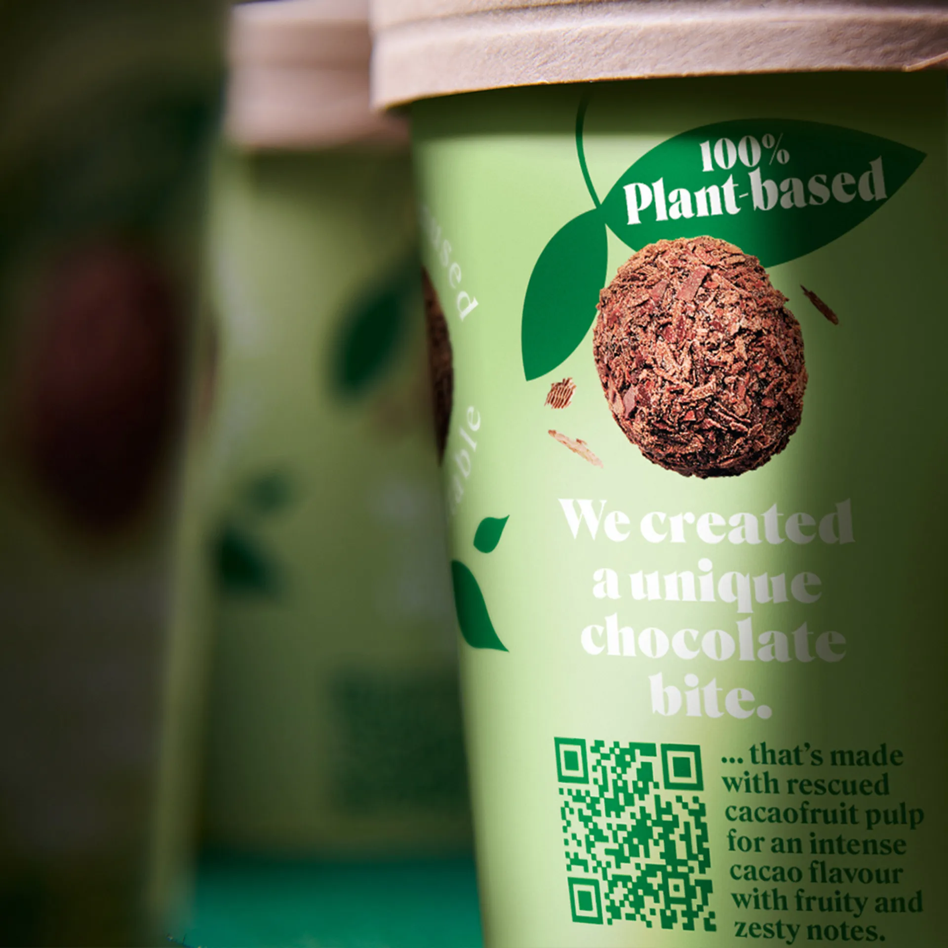
No sustainable story and no upcycled product without a sustainable package. Fully upcycled cups were selected to carry the products: made of agricultural waste, CO2 neutral and with an environmental impact that is 47% lower than paper made of trees. Moreover, the choice of a cup was also obvious as we wanted to bring the product as a real on-the-go chocolate bite. Easy to grab, handy to travel and simple to enjoy.
"Catching a fish requires experience, patience, having insights about the environment, knowing how to work with your gear. You guys have those skills, that’s why you’re not ‘goingtofish’ but ‘catchafish’."
Manu Buijle - Marketing & Product Manager Gudrun Group
VISUAL IDENTITY
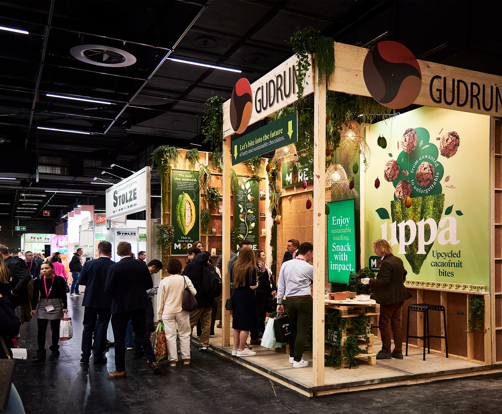
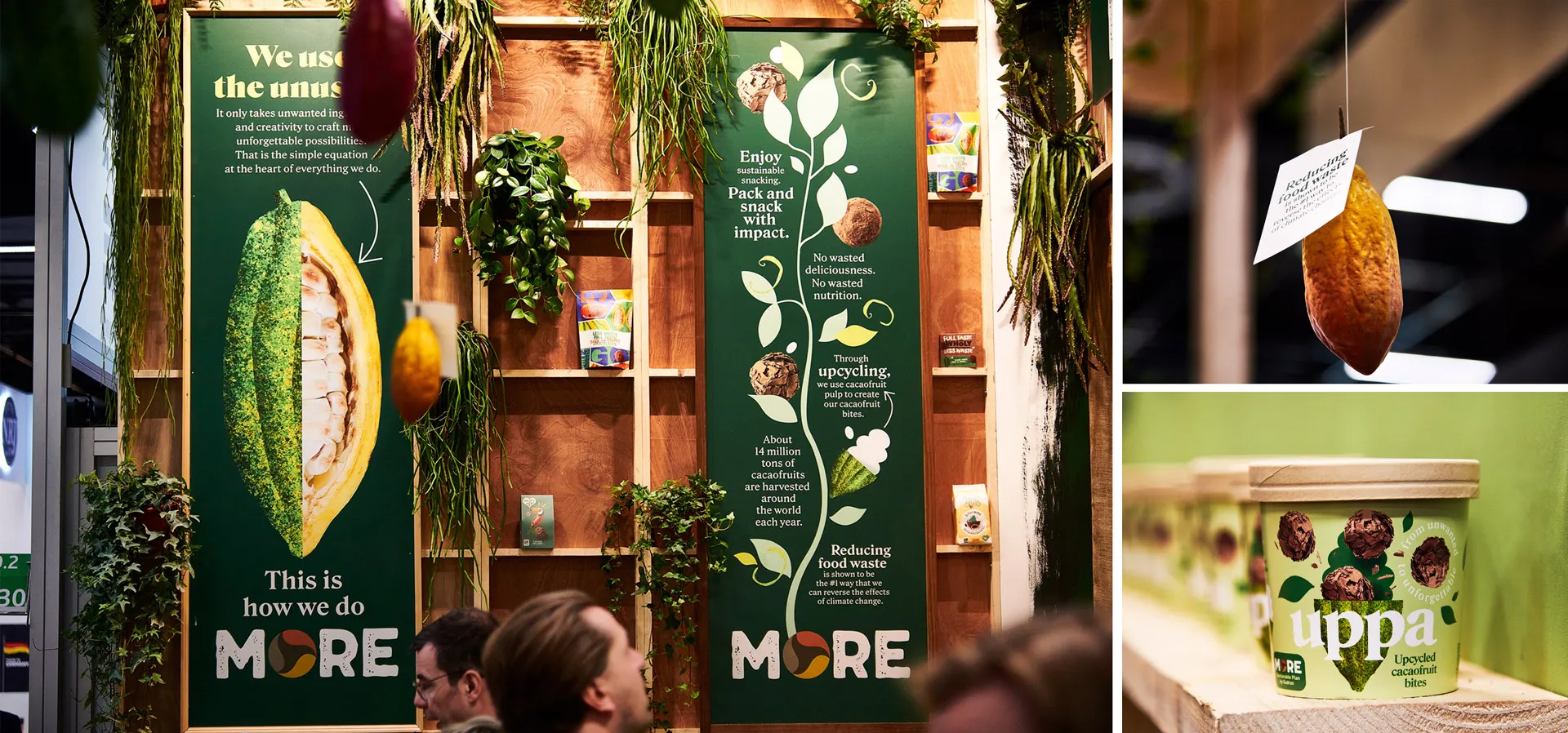
We captured the brand’s vision in a dynamic design that could literally grow in every detail, attract in every touchpoint and explode in every bite, inspiring the audience with its magnificent story. One rule: if you can make it upcycled, just do it. The booth fair at ISM, crafted with upcycled materials was a refreshing oasis between the gaudy and artificial exhibition booths, giving a stage to Uppa’s amazing story.
