<div class="embed-2-images"</div>
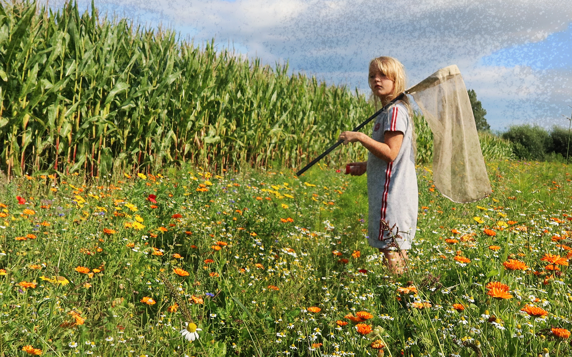
As (On)Kruid is a startup with limited resources while being a game changer, we chose to invest where it matters most for them: a promising retail brand. We committed a share of our work to making a tangible difference for local nature, building valuable relationships with consumers, and advancing social entrepreneurship. We adapted our strategic approach on brands to their scale: the guys did the heavy lifting while we served as their sounding board, helping them understand what truly makes them unique. Tea isn’t the goal in itself; it’s the vehicle, part of a bigger picture that points to a brighter future for farming and biodiversity as a whole.
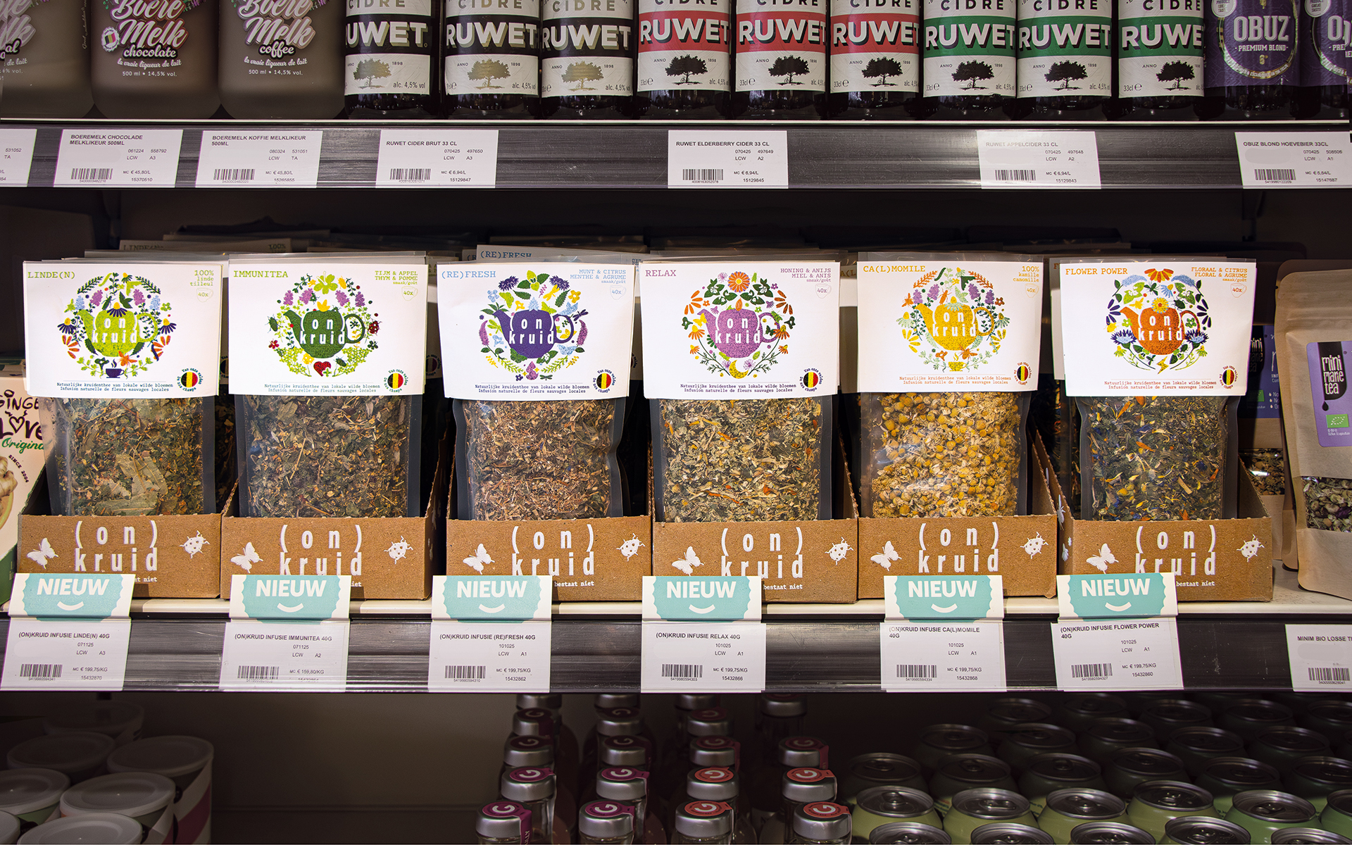
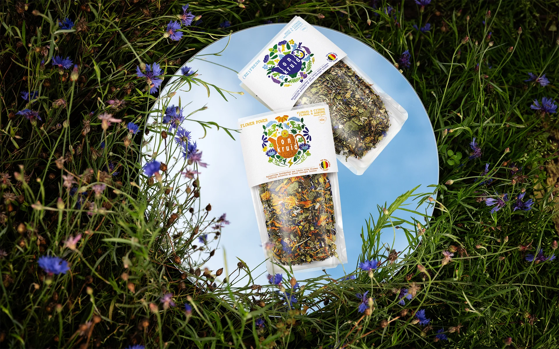
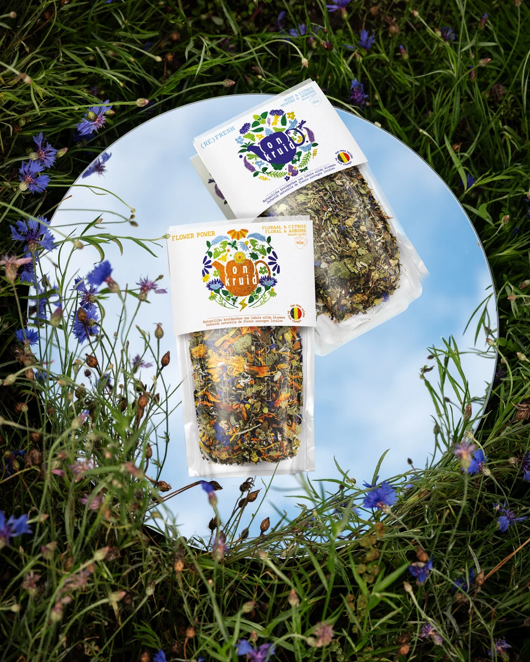
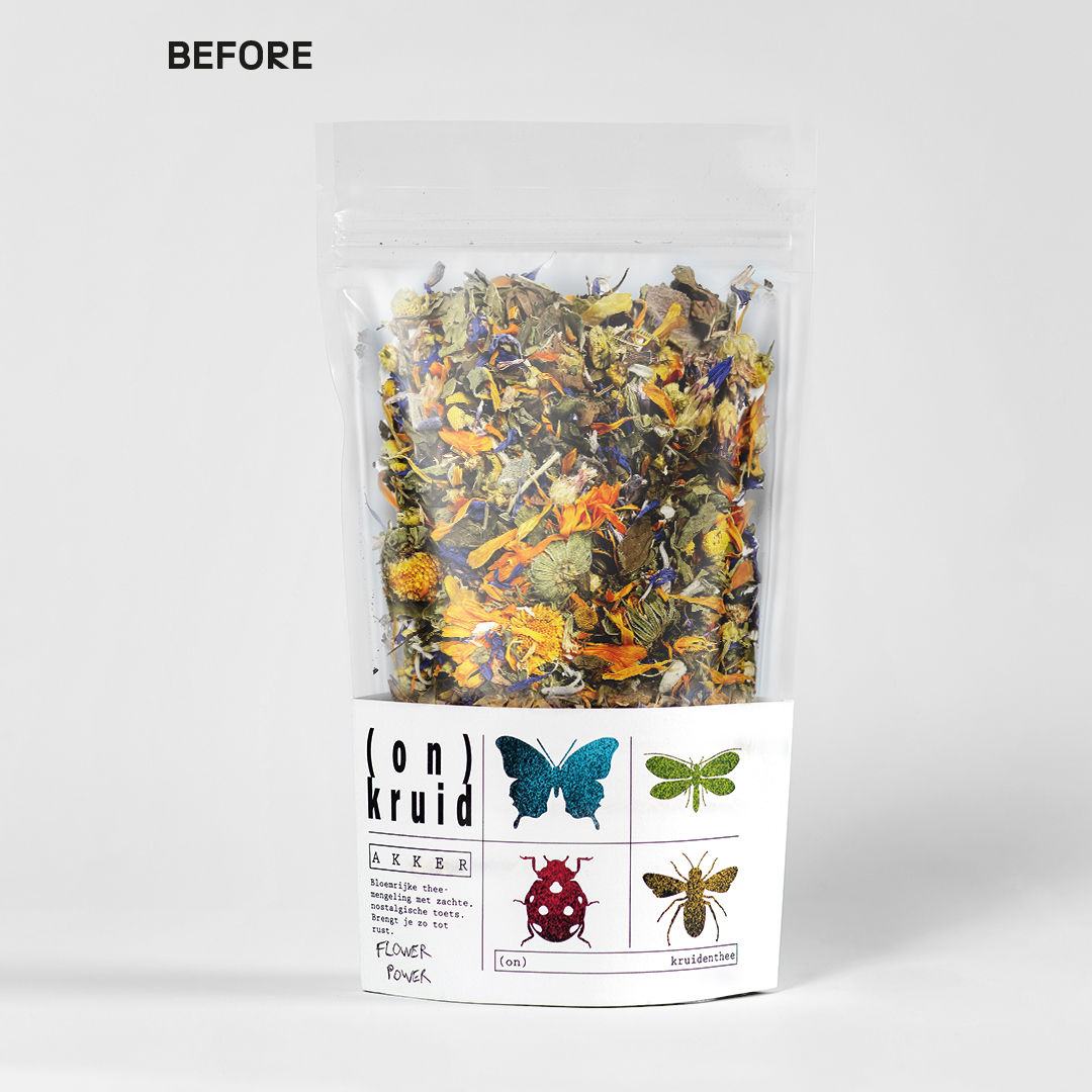
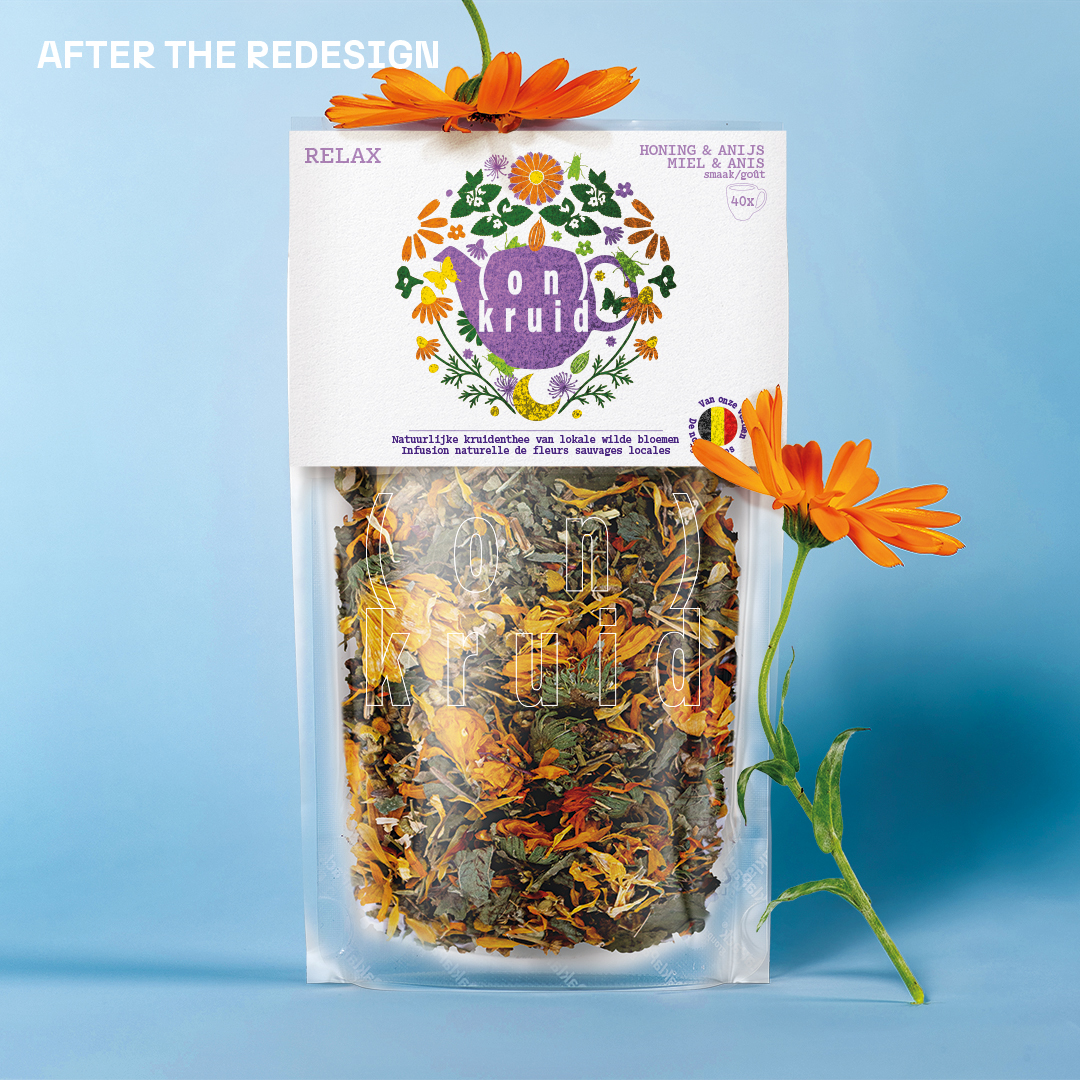
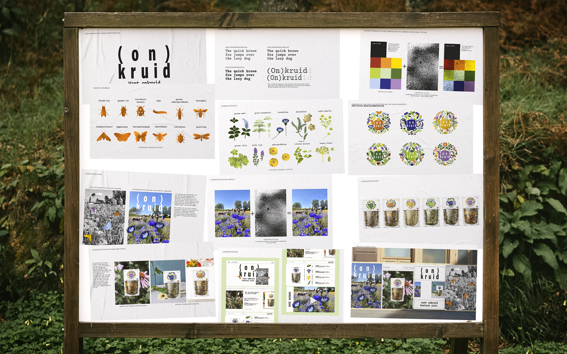
We’ve had our ups and downs—no denying it. Early on, we were so committed to change that we changed everything. We pushed the design so far that Brecht, Anthony, and Torsten couldn’t see themselves in it, and neither could consumers. Going through that phase of despair from both sides, it also gave everyone better understanding of the value of the current brand while having flaws. Since then, we’ve recalibrated. The logo, recognisable as it is, couldn’t carry enough impact on pack, so we introduced a modular rosette system that places tea at the centre of the story, with flavour cues and its biodiversity mission radiating around it. The result is a serene, confident presence on tactile paper sleeves and proud transparent bags, with clear differentiation across six exciting flavours. And a packaging system allowing various visual opportunities for future product innovations.
<div class="content-width"</div>
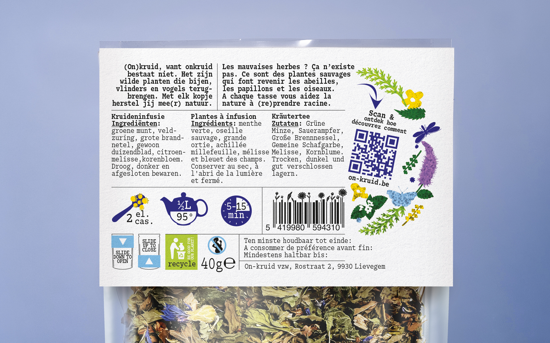
We created a new brand identity that doesn’t simply mirror the packaging. It’s in conversation with it. We refined the brand assets to align with the mission and built a richer visual toolbox that says far more than “insects”. We created a dynamic and playful identity, and a true reflection of the people behind (On)Kruid. This with a recognisable brand, already in people’s hearts.
<div class="embed-2-images"</div>
<div class="content-width"</div>
A first major retail adventure has just begun: (On)Kruid is now available on shelf at Aveve. It’s their ideal partner to scale impact, sales growing step by step, matched by sustainable production, step by step. As momentum builds, the brand becomes a game changer that draws the attention of other retailers across Belgium. And that’s the goal to make impact as big as possible, while always staying true to who Brecht, Anthony, and Torsten are. Committed.
“Catchafish challenged us on multiple levels. From the very start they had a perfect feel for our mission and where we want to take (On)Kruid: something that’s retail-proof and really stands out on the shelf. Together we created something truly beautiful.”
Brecht Herteleer, Co-Founder (On)Kruid